Ruleset Editor and API
This article will go over how to use the Ruleset Editor and the functions of the JavaScript API.
A Note on Security
Our Rulesets function via HTML and a JS API that allows you to write calls that execute functions against our backend. The function calls you have access to in the API can only alter data in the current Campaign, and do not give players access to data in other Campaigns or from Modules that they have not purchased.
The JavaScript code runs inside a hardened sandbox (SES Compartments) that isolates it from the rest of the application. Sandboxed scripts have no access to the network, browser storage, cookies, the DOM, or other users' data — only the explicit Ruleset API and a small set of safe language built-ins (Math, JSON, Date, etc.) are exposed. This ensures macros cannot pull data from other users or produce malicious results. Furthermore, all API calls to the backend are rate-limited to reasonable levels to prevent a user from writing a malicious script. The writing of malicious code is strictly prohibited by our Terms of Service.
Create a Ruleset
To begin creating rulesets, first log in, or from the Campaigns page, click “Ruleset Editor” at the top.
You will be taken to the Ruleset selection page. If you have never created a Ruleset before, this page will be empty.
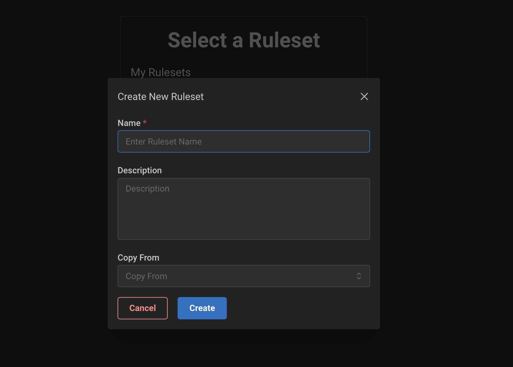
Click “Create New Ruleset” to begin making or editing an existing Ruleset. A good way to get started is to copy an existing one so you can see examples of other implementations. You can always remove any unnecessary code or settings once you do so. Provide a Name, a Description of the Ruleset, and optionally select a Ruleset to copy data from. You can also start completely fresh.
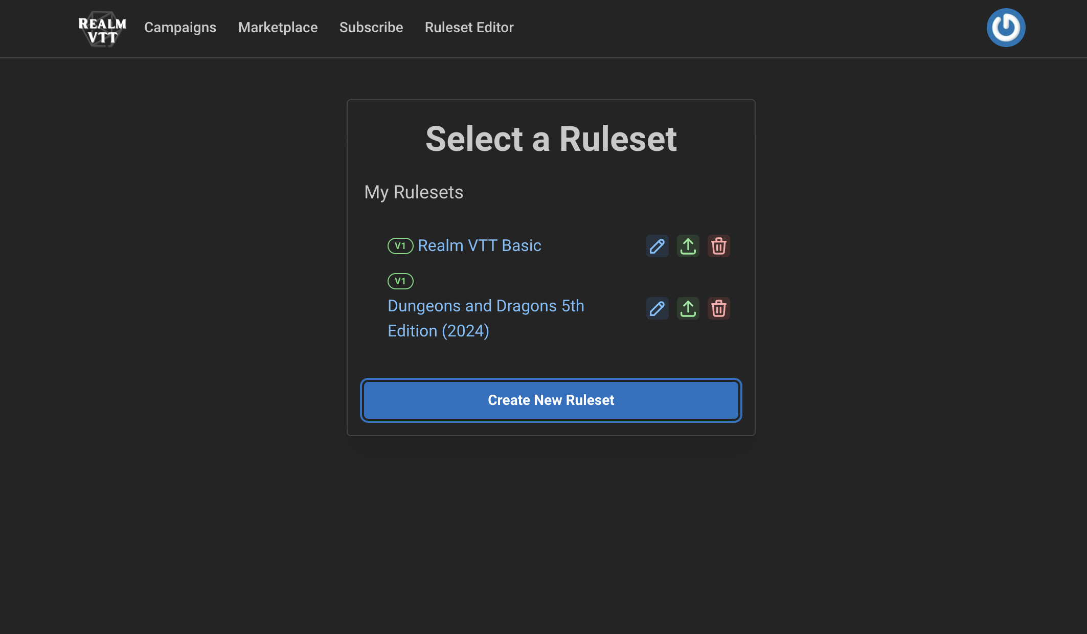
Click “Create New Ruleset” to begin making or editing an existing Ruleset. A good way to get started is to copy an existing one so you can see examples of other implementations. You can always remove any unnecessary code or settings once you do so. Provide a Name, a Description of the Ruleset, and optionally select a Ruleset to copy data from. You can also start completely fresh.
Once the Ruleset is created you will be navigated to the Records tab of the Editor.
Rulesets are composed of Records, types of data that are defined by the fields that can be edited or changed on the record’s HTML.
The Settings tab of the editor is used for editing important settings of the Ruleset to define how certain VTT functions behave, options for Effects, etc. (more on this later.)
Saving Changes
On both the Records and Settings tab there is a Save button. Be sure to save often if you are not using your own source control! You will be prompted when navigating to a different function if you have not saved, but it is easy to lose changes on accident.
Note: Ruleset code can get quite complex! We recommend that you rely on your own source control such a git and use an editor offline such as Visual Studio Code. Then, copy and paste changes into the editor.
Roll Syntax
Realm VTT's roll parser handles standard dice notation plus a handful of extras for exploding dice, dropping, damage labels, inline colors, and success-count pools. The exact same string works in three places:
/roll 2d6+3in chatapi.roll("2d6+3")from a ruleset scriptapi.promptRoll("Attack", "2d6+3")to ask the player before rolling
Basics
Notation | Meaning |
|---|---|
| Roll one six-sided die |
| Roll three d8s and sum |
| Rolled dice plus flat modifier |
| Mixed types and signs |
| Percentile (rendered as a tens+ones pair) |
| Standalone percentile tens die |
Exploding Dice
Append to the die size to make a group explode.
Notation | Meaning |
|---|---|
| Explode: any die rolling its max spawns a bonus die; each die (parent + children) is kept as its own result |
| Compound: each parent's whole chain sums into one value (Shadowrun/WoD style) [Currently renders the same as above.] |
| Explode once: at most one bonus per parent |
| Compound once |
| Explode when the roll meets a threshold (here: on 5 or 6) |
Only the specific group gets the modifier — 1d6+1d4! explodes the d4 and leaves the d6 alone.
Dropping Dice
Notation | Meaning |
|---|---|
| Drop the highest 1 die |
| Drop the lowest 1 die (classic ability-score roll) |
Dropped dice still show in the chat card, greyed out so players can see what was rolled.
Damage Types / Labels
A space-separated label after a die group tags those dice with a damage type:
1d8 fire + 1d6 cold + 2 lightning
Labels propagate rightward so 1d6 + 1d4 fire makes the whole expression fire damage. An explicit default label means "no damage type, sum normally." Labels show as icons in the chat card and are available to ruleset scripts on each result entry's type field.
Inline Colors
Wrap one or two hex values in brackets to tint a specific die group in the 3D tray and the chat card:
Notation | Meaning |
|---|---|
| Red die, default text color |
| Red die with black numbers |
| Green d6 that also explodes |
Colors are a visual concern only — they don't change the damage label. So 1d20[#ffffff] default gives you a white die whose damage type is default, and 1d10![#0000ff] + 1d10[#ff0000] + 1d10[#00ff00] rolls three distinct-colored d10s where only the blue one explodes.
For labeled groups from scripts you can also pass a diceColors map in metadata — see the examples below.
Success-Count Pools
Wrap an expression in {...} and follow with >N, <N, or =N to count how many dice met the threshold instead of summing:
Notation | Meaning |
|---|---|
| Count dice ≥7 (World of Darkness dice pool) |
| Count compound chains that sum to 8+ (Shadowrun) |
| Explode on 6s, count every die (original + bonus) that's 5+ |
| Count exact matches |
The chat card shows the successes count alongside the individual results. ! counts every individual die; !! counts chains. A trailing >N without braces is still the explosion threshold, not a success count.
Using it from scripts
api.roll(rollString, metadata, rollType) — rolls immediately, no prompt.
// Exploding damage with mixed types and labels
api.roll("2d6! fire + 1d4 cold", { source: "fireball" });

// Per-label colors via metadata (alternative to inline [#hex])
api.roll("1d6 hope + 1d6 fear", {
  diceColors: {
    hope: { diceColor: "#4488ff", textColor: "#ffffff" },
    fear: { diceColor: "#ff4444", textColor: "#000000" }
  }
});

// Shadowrun-style success pool
api.roll("{6d6!!}>=8");
api.promptRoll(name, rollString, modifiers, metadata, rollType) — opens the roll dialog first so the player can tweak modifiers before confirming. Same syntax:
api.promptRoll(
  "Longbow Attack",
  "1d20 + 1d8 piercing",
  [{ label: "Advantage", value: "+1d4" }],
  { weapon: "longbow" }
);

api.promptRoll(
  "Exploding Wild Magic",
  "1d100![#9b59b6] arcane",
  [],
  {}
);
Both functions return a promise that resolves after the 3D animation completes, with the full result including per-die values, dropped dice, success count (if any), and resolved totals — ready to feed back into the rest of your ruleset logic.
Records and Lists
All Rulesets must have a Characters type and an NPCs type. These cannot be removed and are listed by default.
From the Records tab you can create new Record types or List types. For both, you will see a Required Fields section and an area to enter the HTML and JavaScript.
Changes in the editor appear after a brief second in the Preview section, which shows you what the Record type looks like in the VTT, and allows you to add Tabs to it (or edit the tabs.)
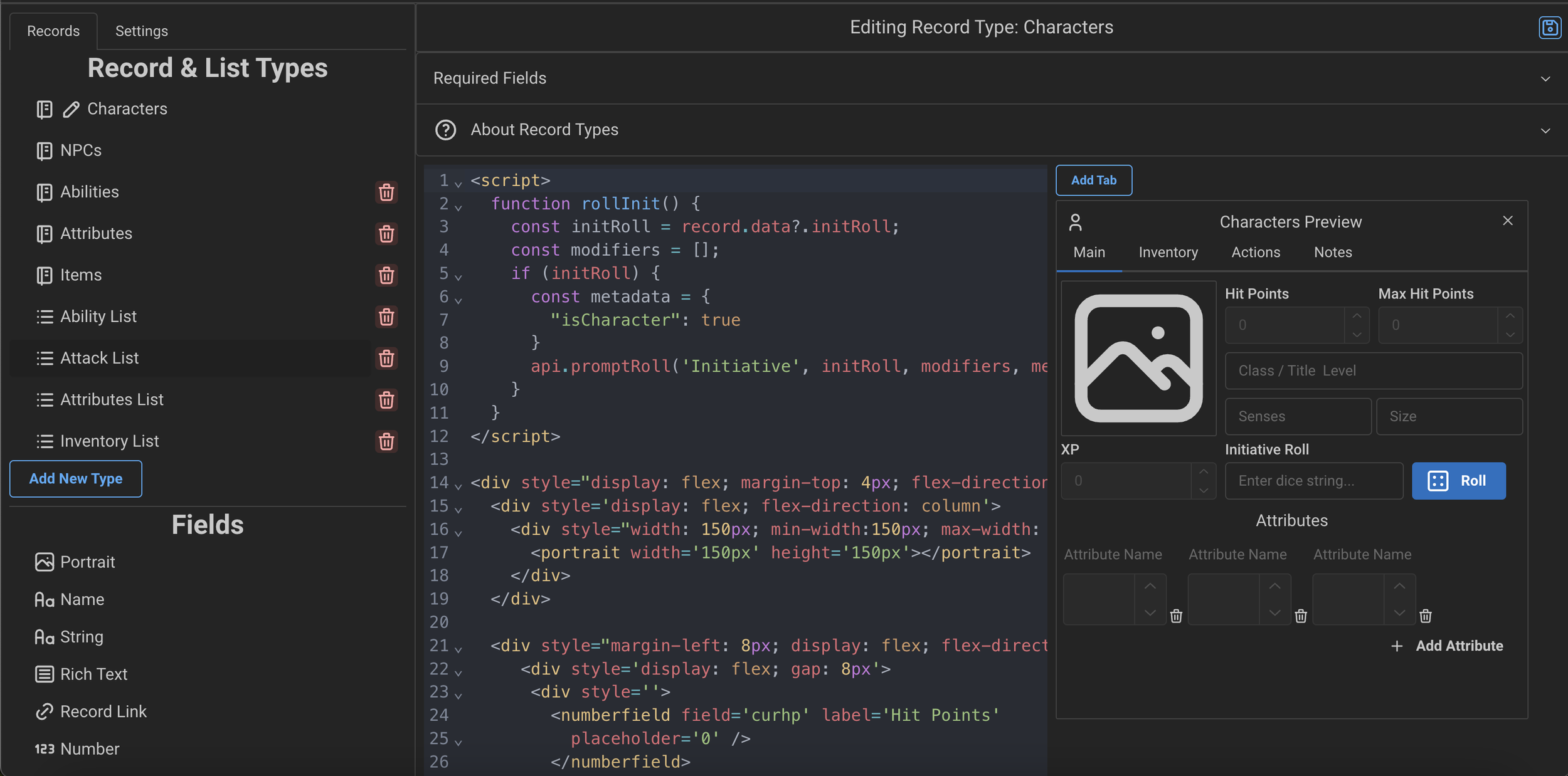
Records
For each defined Record type you will see a section in the “Compendium” of the VTT that allows users to create new entries of that type. For Records that will be used in a List type (such as Items, Spells, or Abilities) we recommend also including a portrait field in the HTML (more on this later in the Fields section.)
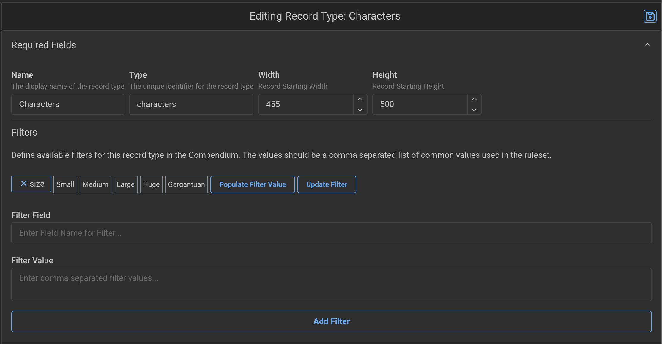
All Records have the following required fields:
Name: How it is displayed to the players in the VTT
Type: The underlying “type” used by the backend and when querying for this record type
Width: The default width of the record window
Height: The default height of the record window
Filters: This will define filters that players in the VTT can select in order to quickly search for specific records. In the above example, there is one set for the
sizefield
Record Tabs
All records have the ability to add or edit Tabs. Click the “Add Tab” button above the Preview to add a new tab. Click a tab and click “Edit Tab” to remove Tab, change its position, or rename it.
Each tab has their own HTML and JS code for it. Once clicking on a Tab, enter the HTML and JS for that tab.
Tabs can be hidden or unhidden for a record by setting the data at tabs.${tabName}.hidden = true|false. Example:
```Test_HideUnhide
api.setValue("tabs.Inventory.hidden", !tabs["Inventory"]?.hidden);
```
Lists
Lists are built in a similar way as Records but they are in fact not shown in the Compendium. A List Record Type allows you to define one element of a List of elements that can then be added to a record type. For example, you might have a Items Record Type. And then you might also define an Item List Type. The Item List would be rendered on the Character Sheet so you can create an Inventory of Items.
From the List type you define in the HTML and JS the behavior or one element of the list. Then, when save it when done. Once you want to add that List Type to a Record sheet, go back to that Record type on the Records & Lists selection, then scroll all the way down in the “Fields” section, and click the defined List type. (More on this in the Fields section.) List do not have tabs like records do.
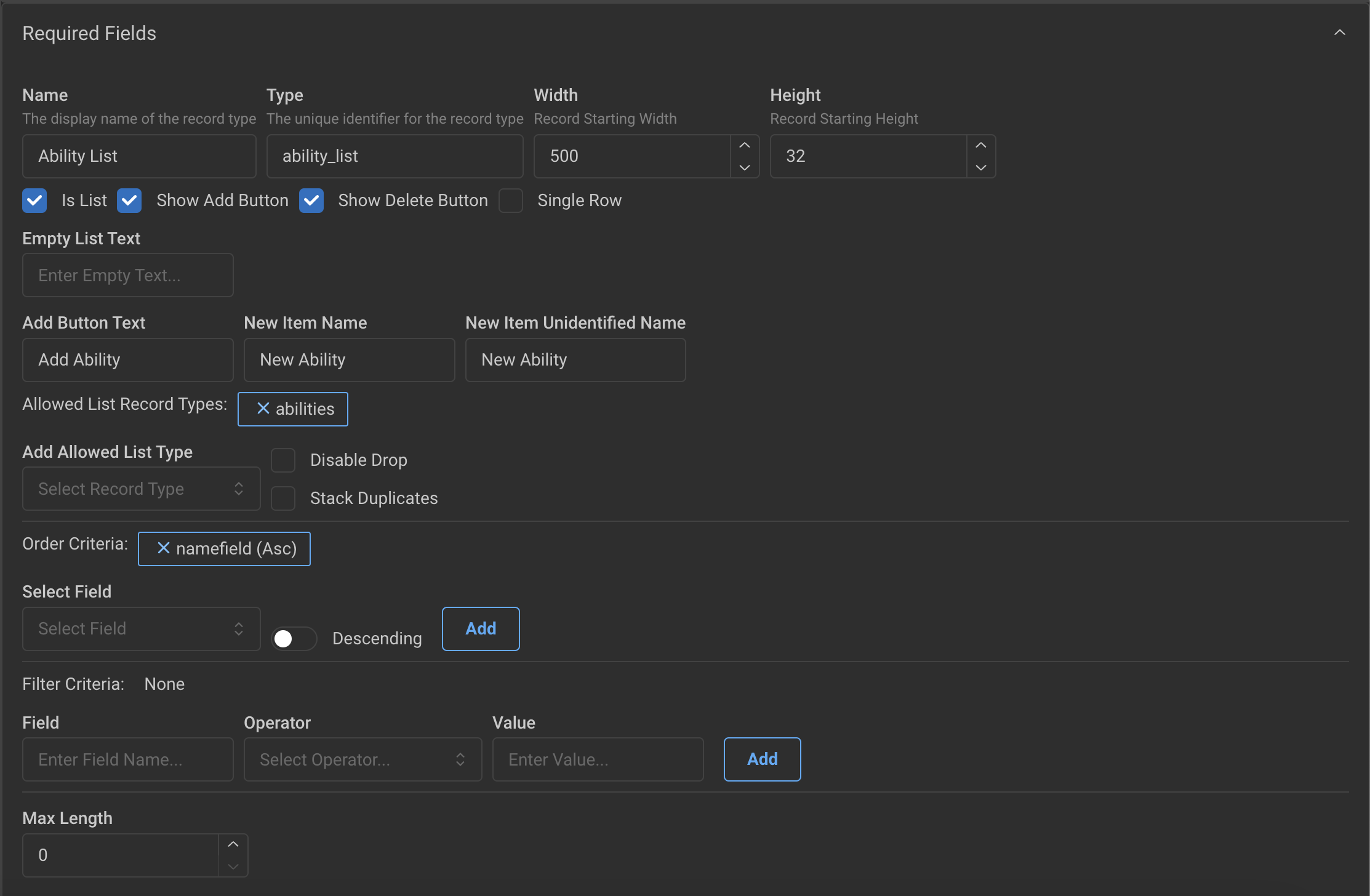
All Lists have the following required fields:
Name: A display name for the List in the Editor
Type: The underlying “type” used by the VTT when adding this list to a record
Width: The default width of the editor preview window (unlike records, this does not affect the element size when rendered)
Height: The default height of the editor preview window (unlike records, this does not affect the element size when rendered)
Show Add Button: Enables the ability to Add one-off elements of the list on the record that uses it
Show Delete Button: Enables the ability to Delete elements from the list on the record that uses it
Single Row: Renders each element of the list in one row, instead of each being its own row
Empty List Text: Text to show in the List when rendered without elementgs
Add Button Text: Text to use in the Add button
New Item Name: Name to set on all new elements added to the list
New Item Unidentified Name: All records have an Unidentified Name, and this lets you define the default Unidentified Name when adding elements to this list
Allowed List Record Types: This sets the default types that can be drag and dropped to the list. Most lists only define one, but there may be cases where you want two different record types to be able to be added to a list.
Disable Drop: This disables the drag and drop behavior when allowed list record types are set. This is useful when you want it to default to the icon of an allowed record type on Add of a new item, but wish to handle the Drag and Drop behavior manually (such as in the Drag and Drop script of a record, more on this later.)
Stack Duplicates: Enable this setting when you want duplicate entries to be counted more than once, and provide the name of the field used to keep track of the count.
Order Criteria: Fields that appear in the Record HTML will show up in this dropdown. Select the field you want to sort the list by (such as name, count, etc.) and then whether it is Ascending of Descending. You can provide more than one criteria which is sorts in order. (Example, sorting by name then by count.)
Filter Criteria: Define filter criteria when you want the list to only show elements that match a specific filter. Select the field, then the operator, then the value you are looking for.
Example: Suppose you want a list of Attacks on another tab, and suppose you want to only show Attacks with Weapons from the Inventory that are Equipped. You could add two filters, one for a “type” field and one for an “equipped” field.
Dynamic Filters: If you want a filter to be dynamic and defined by another value on the parent record of the list (for example, a dropdown you have added on the record that displays the list) you can set the value to “{path.to.value}”. For example, say you have a dropdown field called “filterValue” you would set this to: “{data.filterValue}”. In this case, a value of an empty string (i.e. ““) will just display all elements.
Max Length: Use this field when you want to impose a maximum length of the list.
Note: Lists have additional attributes that can be passed to the HTML in which they are entered on the record. See the <list> tag details below in the Fields and HTML API section.
HTML API
Fields and HTML API
The HTML in Realm VTT is modified to support our support fields. Additionally, each record type can define a “script” and in the script you can put record-level event handlers. The host invokes any of the following if they appear in your <script> block:
onDrop(type, recordLink, sourceInfo)— fires when a record is dropped onto this record.onBroadcast(name, data, meta)— fires for everyapi.broadcastin this campaign (not just ones targeting this record). Filter bynamefirst.metacarries{ senderId, recordId }so a script can scope by sender if needed. Ephemeral; not persisted.onChatMessage(message, roll)— fires for every chat message in this campaign.rollis the message's roll object, ornullfor non-roll messages (narration, system notes, GM whispers). Filter inside the handler — e.g.if (!roll) return;if you only care about dice, orif (roll.metadata?.recordId !== record._id) return;to scope by actor.
// onDrop type is a string such as "spells"
// recordLink example
{
  value: {
    _id: 'abc',
    recordType: "spells"
    name: "Ray of Frost
    data: {...}
  },
  tooltip: "Ray of Frost"
}

//onDrop sourceInfo example
{
 type: "list",
 recordType: "items",
 recordId: "abc-123",
 dataPath: "inventory.data.12"
 index: 12
}
//onDrop sourceInfo example from PartySheet
{
 type: "partysheet",
 itemId: "item-123",
}

// onBroadcast fires for every api.broadcast in this campaign. Filter
// by name first. The third arg `meta` carries { senderId, recordId }
// — useful when you want to ignore your own broadcasts or scope by
// sending record. Payloads are capped at 256KB; not persisted.
function onBroadcast(name, data, meta) {
  if (name === "xp-awarded") {
    // Built-in xp-awarded payload:
    //   { amount, source: "party-sheet" | "api" | ..., recipientIds: [...] }
    if (!data.recipientIds || data.recipientIds.includes(record._id)) {
      showHideLevelUpButton(record);
    }
  }
}

// onChatMessage fires for EVERY chat message in this campaign.
// `roll` is the message.roll object or null for non-roll messages.
// Filter inside the handler — by name, by roll type, by actor, etc.
function onChatMessage(message, roll) {
  if (!roll) return;                                   // dice-only handler
  if (roll.metadata?.recordId !== record._id) return;  // only my rolls
  if (roll.rollType === "stability-save" && roll.total < 4) {
    const cur = record.data.stability;
    api.setValue("data.stability", Math.max(0, cur - 1));
  }
}
In the Script of a record type, you make also want to create functions used by the fields within. See an example below for how this might look.
Additionally, the JavaScript executed in Records has an API that be called for VTT functions, see the JavaScript API section for more information.
For details on how you can do some more advanced styling of the sheets, see: Advanced Ruleset CSS.
Record Scripts
Record types can also reference code from a “Common” Script that you define. The Common Script is defined in the “Settings” tab under “Additional Settings.” It is a good idea to place re-used code here, so you do not re-write it across all your Record types!
<script>
  function onDrop(type, recordLink, sourceInfo) {
    if (type === 'spells') {
      onDropSpell(recordLink);
    }
  }

  function onDropSpell(recordLink) {
    // Code here...
  }

  function rollInitiative() {
    // Roll initiative for the character
    // Code here ...
  }
</script>

<div style="width: 100%; display: flex; justify-content: flex-end;">
  <button field="rollInitBtn" size="xs" icon="D20" label="Initiative" variant='outline'
    onclick='rollInitiative();'></button>
</div>
Record Styles
The custom tags such as <box> and <stringfield>, etc., do not support the style tag. However, you can inject styles in divs using "style" or by the <style> section of a record.
The class prop is supported on all typical HTML tags as well as the following Realm tags:
box
stringfield
namefield
numberfield
<style>
  .example {
    background-color: var(--mantine-color-tertiary-filled);
  }
</style>

<div style="width: 100%; display: flex;">
  <box field="itemProps" class="example">
    <stringfield field="type" placeholder="Enter type..."></stringfield>
  </box>
</div>
Record Fields
Here are all the currently supported field types with the HTML.
With the exception of the Name, Unidentified Name, and Portrait, the values for all Fields are stored in the data object of each record. (Example, a character with a number field defined as “hp” will have it stored in data.hp). The following fields are stored directly on each record (i.e. not in data):
name
unidentifiedName
portrait
locked
Record Metadata
Sometimes you need access to the metadata of a field, for example, manually setting whether a field is hidden. This is stored in the fields section of a record. Example, setting the “hp” value to hidden, is stored in: fields.hp.hidden = true. (More on this later.)
Accessing List Values
Sometimes in the API you need to access or change the value in a list. You can do this using dot notation (more on this later) to the element in the list. Example: The data path to the “equipped” value on the first element of a list called “inventory” would be: data.inventory.0.data.equipped
Colors
Colors for fields use the Mantine color system. Click here to see more information.
Icons
Icons that are available in Realm VTT come from Tabler icons or Game Icons. If the Icon name starts with Icon it is assumed to be Tabler. If it starts with “Gi” it checks for the icon from Game Icons.
Portrait
Description: Allows setting and displaying a portrait for the record. For Characters and NPCs, it also allows setting a Token. Portraits (and Tokens) can be edited when the Record is unlocked by clicking on the Portrait. When set, it can be viewed or shared with players by clicking on the Image icon in the bottom-right.
Attributes:
field - The data field to store the portrait, which should always be “portrait” — this cannot be changed
All common attributes (see Common Attributes section below)
Example:
<portrait field="portrait" width="150px" height="150px"></portrait>String Field
Description: Allows setting and displaying a string value on the record.
Attributes:
field - The data field to store the string value
defaultvalue - Default value if none is set
textalign - Text alignment (left, center, right). Aligns the label and the input.
multiline - If true, allows multiple lines of text
maxrows - Maximum number of rows for multiline input
editable - If “true” this field is always editable even if the record is locked.
bold - Show the field value in bolder font, if true
All common attributes
Example:
<stringfield
  field="description"
  label="Description"
  multiline="true"
  maxrows="4"
  placeholder="Enter description..."
></stringfield>
Rich Text Field
Description: Allows setting and displaying rich text on the record.
Attributes:
field - The data field to store the rich text
disablecontrols - If true, hides the formatting controls
All common attributes
Example:
<richtextfield
  field="notes"
  label="Notes"
  height="300px"
></richtextfield>
Number Field
Description: Allows setting and displaying a number value on the record.
Attributes:
field - The data field to store the number
minvalue - Minimum allowed value
maxvalue - Maximum allowed value
maxvaluefield - Used only if maxvalue is not provided, defines a field that stores the max value for this numberfield. Must be another numberfield.
showsign - If true, always shows + or - sign
defaultvalue - Default value if none is set
textalign - Text alignment (left, center, right). Aligns the label and the input.
editable - If “true” this field is always editable even if the record is locked. If “false” it is always disabled.
bold - Show the field value in bolder font, if true
All common attributes
Example:
<numberfield
  field="modifier"
  label="Modifier"
  showsign="true"
  minvalue="-5"
  maxvalue="5"
></numberfield>
Name Field
Description: Special field for displaying and editing the record's name, with support for unidentified states. If on a List type, it is the name of that List element.
Attributes:
field - The data field for the name (usually "name")
defaultvalue - Default name if none is set
textalign - Text alignment (left, center, right)
multiline - If true, allows multiple lines
maxrows - Maximum number of rows for multiline input
bold - Show the field value in bolder font, if true
editable - If “true” this field is always editable even if the record is locked. If “false” it is always disabled.
All common attributes
<namefield
  field="name"
  label="Character Name"
  placeholder="Enter name..."
  size="xl"
></namefield>
Record Link
Description: Creates a link to another record.
Note: See the API section for setRecordLink on how to use this field. It expects the value to be a recordLink (like from an onDrop handler.)
Attributes:
field - The data field containing the linked record data
All common attributes
<recordlink
  field="weapon"
  label="Equipped Weapon"
></recordlink>
Checkbox
Description: Creates a checkbox for boolean values.
Attributes:
field - The data field to store the boolean value
All common attributes
Example:
<checkbox
  field="proficient"
  label="Proficient"
></checkbox>
Radio Button
Description: Creates a radio button for selection within a group.
Attributes:
field - The data field to store the selection, should be the same for all radio buttons in the same group
All common attributes
Example:
<div>
  <radio
    field="alignment"
    label="Lawful Good"
    value="lg"
  ></radio>
  <radio
    field="alignment"
    label="Neutral Good"
    value="ng"
  ></radio>
</div>
Label
Description: Displays static text.
Attributes:
textalign - Text alignment (left, center, right)
template - (string) Computed text with
{...}placeholders. See Templates below.hideifempty - When
"true", hide the element if thefieldvalue isnull,undefined, or"".0andfalsestill render.(children) - (text node) If
labelis not set, the element's text content is used as the displayed label.labelattribute always wins for backwards compatibility. Example:<label>Hit Points</label>.All common attributes
Example:
<label
  label="Combat Statistics"
  size="lg"
  color="blue"
  textalign="center"
></label>
Divider
Description: Adds a horizontal or vertical line separator.
Attributes:
orientation - Direction of the divider ("horizontal" or "vertical")
All common attributes
Example:
<divider
  label="Combat"
  orientation="horizontal"
  size="lg"
></divider>
Tag
Description: Adds a tag that displays text with tooltip descriptions.
Attributes:
field - The name of the field containing the name of the tag in the underlying data
tooltip - The name of the field containing the tooltip in the underlying data
tooltipquery - (optional) If present, we query for a record in the campaign to get the tooltip looking for a record with the same name as the "field" (above) in the underling record
tooltipfunction - (optional) If present, we call the given function using the name of the tag as the value, in order to determine what the tooltip should be.
variant - Visual style ('default' or 'filled')
color - Color of the tag (uses Mantine color system)
size - Size of the tag (xs, sm, md, lg, xl)
All common attributes
Example:
<tag
  field="status"
  tooltip="Current status effect"
  variant="filled"
  color="blue"
  size="sm"
></tag>

<!-- This will render a tag using the name of the underlying record and query for a "trait" record. If found it will render the tooltip using `trait.data.description` -->
<tag
  field="name"
  color="default"
  tooltipquery='{"type": "traits", "tooltip": "data.description"}'
></tag>

<!-- This will call the function below to get the tag's tooltip. -->
<script>
  function getTraitToolTip(value) {
    switch (value) {
      case "Unholy":
        return "<p>This is <b>bad</b> and evil.</p>";
      case "Weapon":
        return "<p>This is a <b>weapon</b>.</p>";
      default:
        return "";
    }
  }
</script>

<tag
  field="name"
  color="default"
  tooltipfunction="return getTraitToolTip(value);"
></tag>
Dropdown
Description: Creates a dropdown selection menu.
Attributes:
field - The data field to store selection
options - Array of options (as JSON string)
optionsquery - JSON of a query to get data from the backend. This will only get data that exists in the current campaign. Expects JSON string in the format:
{"type": "effects", "query": {}}where “type” is a record type (or one defined by the VTT such as ‘effects’) and “query” is a MongoDB style query (if you wish to filter it to specific entries.)optionsfunction - Define a function to call that returns an Array of options. Only used if options and options query not defined. (e.g. “optionsquery=’return someFunction();’” where “someFunction” returns an array in the same format expected by “options.”
icon - Icon to display
multiselect - Allow multiple selections if true
searchable - Enable search functionality if true
combo - If "true" indicates that this is a combobox that allows the user to type in their own value.
defaultvalue - Default selected value
All common attributes
Example:
<dropdown
  field="class"
  label="Character Class"
  options='[
    {"value": "fighter", "label": "Fighter"},
    {"value": "wizard", "label": "Wizard"},
    {"value": "rogue", "label": "Rogue"}
  ]'
  searchable="true"
></dropdown>

<dropdown
  size='sm'
  field="effects"
  label="Effects"
  searchable='true' multiselect='10'
  description='Effects that this ability can apply'
  optionsquery='{"type": "effects", "query": {}}'
  placeholder='Select Effects...'>
</dropdown>
Progress Bar
Description: Adds a horizontal progress bar
Attributes:
field - The name for the field of the progress bar (not used for data)
currentvaluefield - The field for current value of the progress bar
maxvaluefield - Field containing the maximum value
maxvalue - Static maximum value, if maxvaluefield is not used
color - Can be set to 'health' to render the progress bar in different shades depending on the %-remaining
All common attributes
Example:
<progressbar
  currentvaluefield="hp"
  maxvaluefield="maxHp"
  label="Hit Points"
  color="health"
  radius="xl"
></progressbar>
Counter
Description: Adds a horizontal list of checkboxes for tracking counts.
Attributes:
field - The data field to store the count value
maxvalue - Static maximum value, used if maxvaluefield is not set
maxvaluefield - Field containing maximum value
All common attributes
<counter
  field="hitDice"
  label="Hit Dice"
  maxvaluefield="level"
></counter>
Button
Description: Displays a clickable button.
Attributes:
field - The data field to bind to. If the field contains a string, it will use this as the label for the button instead of the
labelproperty.label - The label for the button if a string is not set in the
fieldof the underlying data.tooltip - A string value tooltip to render for the button. Expects an actual string, not a value containing underlying data.
icon - Icon to display on the button, if set
disablediflocked - If true, button is disabled when record is locked, if false it is enabled even when locked
template - (string) Computed text with
{...}placeholders. See Templates below.hideifempty - When
"true", hide the element if thefieldvalue isnull,undefined, or"".0andfalsestill render.(children) - (text node) If
labelis not set, the element's text content is used as the displayed label.labelattribute always wins for backwards compatibility. Example:<label>Hit Points</label>.All common attributes
Note: Buttons also support the custom sizes "xxs" and "xxxs"
Example:
<button
  label="Roll Initiative"
  tooltip="Click to roll!"
  onclick="rollInitiative();"
  icon="dice"
  color="blue"
  variant="filled"
></button>
Icon Button
Description: Displays a button with different icon states. Can be used to toggle different states, or just have a button that is a singular icon.
Attributes:
field - The data field to bind the current value/state of the button to
disabled - Renders the icon button as a static non-clickable icon.
disablediflocked - If true, button is disabled when record is locked, if false it is enabled even when locked
options - Array of state options (as JSON string)
Uses the JSON format
[ {"value": "value", "label": "Label”, "icon": "IconName"} ]
getoptions - Function name to get options dynamically
All common attributes
Example:
<iconbutton
  field="lightSource"
  options='[
    {"value": "off", "label": "Light Off", "icon": "IconBulbOff"},
    {"value": "dim", "label": "Dim Light", "icon": "IconBulb"},
    {"value": "bright", "label": "Bright Light", "icon": "IconBulb"}
  ]'
  onchange='onLightChange(value)'
></iconbutton>
Accordion
Description: Creates a collapsible section.
Attributes:
field - The data field to bind the collapsed state to, unless <accordion.control> is defined
icon - Icon to display on the header
listtype - Required type which determines how this list is rendered. Must match a List Type record defined in the Ruleset.
emptylisttext - Optional string of text to render when the list is empty. Overrides the text defined by the List Type record.
chevronposition - "left" or "right" (default "right"), defines where to render the chevron
All common attributes
Example:
<accordion label="Equipment" field="equipAcc">
  <div style="padding: 8px">
    <!-- Accordion content here -->
    <list field="equipment" listtype="item_list"></list>
  </div>
</accordion>

<accordion label="Equipment" field="equipAcc">
  <accordion.control>
    <!-- Custom content here to render in the accordion instead -->
  </accordion.control>
  <div style="padding: 8px">
    <!-- Accordion content here -->
    <list field="equipment" listtype="item_list"></list>
  </div>
</accordion>
Indicator
Description: Adds an indicator around another field.
Attributes:
field - The data field to display in the indicator
position - Position of the indicator
All common attributes
Example:
<indicator
  field="concentration"
  position="top-right"
  color="yellow"
>
  <stringfield field="spell" label="Active Spell"></stringfield>
</indicator>
Popover
Description: Adds a popover panel that is triggered when clicking the element in the Target. The Panel appears above the Record with the given fields in the Dropdown. Requires a Target and Dropdown child tag (see example below.)
Attributes:
placement - The placement for the popover (top, left, right, bottom, top-start, top-end, etc.) Defaults bottom.
offset - Optional offset from the target to render. Expects a number.
radius - Optional radius of the popover.
width - Optional width for the popover panel.
height - Optional height for the popover panel.
onclose - Optional script to run when the popover is closed.
onopen - Optional script to run when the popover is closed.
Example:
<popover position="bottom" offset="4" witharrow="true" onopen="" onclose="">
  <popover.target>
    <button label="Open Popover" field="Open Popover"></button>
  </popover.target>
  <popover.dropdown>
    <numberfield field="exampleField" label="Example Field"></numberfield>
  </popover.dropdown>
</popover>
Image
Description: Adds a basic Image to the Record. You must have a source URL that you can provide first.
Attributes:
src - The url to the image to render
alt - The alt text for the image.
fit - Option fit attribute, e.g. cover, contain.
width - Optional width for the image
height - Optional height for the image
onclick - Code to execute on click of the image
Example:
<img src="https://some-url-here.io/image.png" alt="img" fit="cover" width="100px" height="100px"></img>Box
Description: Adds a div to the Record that allows for using the API to control visibility.
Attributes:
field - The field name for the box for hiding/unhiding.
width - Optional width for the box
height - Optional height for the box
size - Controls the padding if displayed as a card
radius - Controls the radius of the border if displayed as a card
variant - Optional. Use either “default” or “card” - Card variant has a border with padding
hidden - If hidden by default
scrollarea - The
scrollareaattribute on Box components enables scrolling with values"true"(auto),"hover", or"scroll"for vertical-only scrollbars, or append-xy(e.g.,"hover-xy") to enable both horizontal and vertical scrolling.hideonlocked - If true, hidden when record is locked
hidewhenidentified - Controls visibility based on identification state, useful for fields that should not be visible to players when unidentified
hideforplayers - Controls the visibility for Players. If the user is a Player (not the GM) and this is set to “true” then it will be hidden to them. It can also accept a data path to a value for dynamically hiding/unhiding a control. For example, if this is set to “data.hideToPlayers” and that value on the record is “true”, then it will be hidden for them, and if it changes to false, it will be shown.
Example:
<box field="box2" variant='card' radius='md' size='sm' color='blue'>
  <div style='display: flex; flex-direction: column'>
    <div>A div in a card</div>
    <div>A 2nd div in a card</div>
  </div>
</box>
List
Description: Creates a list of sub-records of a specific type. Renders as vertical rows by default, or as a compact grid of item tiles (layout="grid").
Core Attributes
field — The data field containing the list items.
listtype — The record type to use for list items (must match the
typedefined for the List Type).allowadd — Function to determine if new items can be added — must return
true/false; defined in the script section.getfilters — Function name to determine list filters programmatically.
lazy — When
"true", row elements only render once scrolled into view. Strongly recommended for long, complex lists (spells, abilities). Improves initial tab load. (Row mode only.)scroll — Mantine scroll setting for the list area. Defaults to
"scroll"; also"hover","auto","always","never".variant —
"striped","outline","outline-striped", optionally with"-flex". Aflexvariant tells Single Row lists to stretch to their item's min/max length.keepitemondrag — When
"true", items are not removed from the list when dragged to another list.recordtype — Override the record type used when opening list items (e.g. open features as feats).
icon — Override the icon displayed for list items (e.g.
icon="IconFlare").All common attributes.
Grid Mode
layout="grid" renders each item as a draggable square tile instead of a row. Tiles show the item's icon plus optional chrome (count, equipped ring, status badges, uses) and a hover popover with details and action buttons. Drag-and-drop into the list works exactly as in row mode; equipped items sort to the front automatically. Action buttons and the right-click menu are shown to the record owner (or GM) regardless of whether the record is locked — individual actions/fields still honor their own locked behavior.
layout —
"rows"(default) or"grid".layoutfield — Data field whose value (
"rows"/"grid") overrideslayout. Use with a toggle above the list so players can switch views.cellsize — Pixel size of each square tile (default 56). Tiles wrap to fit the available width.
Tile chrome (declarative field mappings):
countfield — Item field for the stack count; a count > 1 shows a count badge (bottom-right).
equipfield / equippedvalue / droppedvalue — Equip-state field plus the values meaning equipped (glowing ring, sorted first) and dropped (dimmed tile).
descriptionfield — Rich-text field rendered read-only in the hover popover.
usesfield / maxusesfield — Current and max uses/charges. A "current/max" badge shows only when max > 1 (single-use items stay clean).
usesshowsinglefield — Item field that, when truthy, shows the uses badge even at max 1 — for charged non-consumables (e.g. a wand with one charge) that still want their
1/1shown, while one-shot consumables stay hidden. (Level Up sets this todata.hasUseBtn.)usesformat — Template using
{current}and{max}(default"{current}/{max}", e.g."{current} charges").usesposition — Corner for the uses badge:
tl|tr|bl|br(defaulttr).usescolor — Mantine color for the uses badge (default gray).
Status badges — cellbadges (JSON array). Each badge shows when field === eq, in the corner given by position (default tl):
[
  {
    "field": "data.attunement", "eq": "true",
    "activeField": "data.attuned", "activeEq": "true",
    "icon": "IconDiamond", "inactiveIcon": "IconDiamondOff",
    "position": "bl", "label": "Attunement"
  },
  { "field": "data.broken", "eq": "true", "icon": "IconAlertTriangle", "color": "red", "position": "tl", "label": "Broken" }
]
activeField/activeEq(optional) render the badge filled when matched, otherwise a muted/inactiveIcon"needs" state (e.g. attunable-but-not-attuned).coloromitted → the theme primary color.
Tooltip rows — celltooltipfields (JSON array) shown in the popover:
[
  { "label": "Type", "field": "data.type", "capitalize": true },
  { "label": "Location", "field": "data.location" }
]
Actions — cellactions (JSON array). Rendered as buttons in the popover and as right-click menu items (plus the list's standard Copy/Delete). Each entry is one of:
Field set:
{ "label": "Equip", "setField": "data.carried", "setValue": "equipped", "icon": "IconShirt" }— sets a field and runs the list'sonchange; hidden automatically when the field already holds that value.Code action:
{ "label": "Recharge", "fn": "gridRecharge(data.itemIndex)", "icon": "IconBolt" }— runs a ruleset function (see below).Delete:
{ "label": "Delete", "delete": true }.
Any action may add showField / showEq to only appear when item[showField] === showEq (e.g. gate Recharge on "fields.rechargeBtn.hidden" = "false", matching row mode's own visibility flag).
Use
fn— notsetField— when the change needs the ruleset's handler.setFieldonly writes the value and runs the listonchange; it does not fire the item'sonItemEquipped/attune/etc. So asetField"Equip" will changedata.carriedbut skip the logic that sets up ammo/range fields, AC, cyberware slots, and so on. For anything with a real handler, use afnaction that calls a shared function (e.g.onItemEquippedFor(itemDataPath, value)incommonScript, delegated to by both the row dropdown and the grid).
fnargs must not contain quotes. Thecellactionsvalue is a single-quoted attribute holding JSON — nested quotes (\"equipped\") don't survive the sanitize/parse pipeline and silently break the wholecellactionsparse (all buttons vanish). Pass no string literals in the JSON: give each action a zero-arg wrapper whose string lives in JS, e.g.fn: "gridEquip(data.itemIndex)"withfunction gridEquip(i){ equipGridItem(i, "equipped"); }in the tab script. Numeric/boolean args (data.itemIndex,true) are fine.
Use button — celluse / cellusefield / celluseshowfield / celluseshowvalue / celluselabel:
celluse — Ruleset code run when Use is clicked (e.g.
"useGridItem(data.itemIndex)").cellusefield — Comma-separated item fields; Use appears when any is truthy (e.g.
"data.consumable,data.hasUseBtn").celluseshowfield / celluseshowvalue — Alternative equality gate (takes precedence over
cellusefield): Use appears whenitem[celluseshowfield] === celluseshowvalue. Use this when "can use" is a derived/computed flag rather than a plain boolean — e.g. PF2e gates onfields.useBtn.hidden="false", reusing the row's already-computed visibility.celluselabel — Button label (default
"Use"). Use appears both as a filled button in the popover and at the top of the right-click menu.
Script scope for
celluseandfnactions: the code runs with your record tab's script andcommonScript(and any named scripts, e.g.feature-utils) in scope, and receivesdata.itemIndex(the item's index in the list) plusdata.itemDataPath. Define your handler in the tab orcommonScriptand share one implementation between the row's button and the grid (e.g.useInventoryItem/rechargeInventoryItem/onItemEquippedFor). These run through the same lightweight execution path asonchange— no per-hover layout re-render.
Performance: the popover is declarative and cheap (field reads + a template string) and only mounts on hover; there is no per-cell RecordTab. Grid mode is not virtualized, so for very large inventories (hundreds of items) row mode's lazy rendering may still win on initial mount.
List Examples
Get Filters
function getSpellFilters() {
  // If "Hide Unprepared Spells" is checked, filter out unprepared spells
  if (record?.data?.hideUnpreparedSpells) {
    return [{ field: "prepared", operator: "not_equals", value: "unprepared" }];
  }
  return [];
}
Row list
<list
  field="inventory"
  listtype="item"
  label="Inventory"
  allowadd="canAddItem()"
  height="400px"
  scroll="auto"
></list>
Grid list with a rows/grid toggle
<iconbutton
  field="inventoryViewMode"
  defaultvalue="rows"
  options='[{"icon":"IconLayoutList","value":"rows"},{"icon":"IconLayoutGrid","value":"grid"}]'
></iconbutton>

<list
  field="inventory"
  listtype="item"
  layout="rows"
  layoutfield="data.inventoryViewMode"
  countfield="data.count"
  equipfield="data.carried" equippedvalue="equipped" droppedvalue="dropped"
  descriptionfield="data.description"
  usesfield="data.usesRemaining" maxusesfield="data.maxUses" usesformat="{current}/{max}"
  cellbadges='[{"field":"data.attunement","eq":"true","activeField":"data.attuned","activeEq":"true","icon":"IconDiamond","inactiveIcon":"IconDiamondOff","position":"bl","label":"Attunement"}]'
  celltooltipfields='[{"label":"Type","field":"data.type","capitalize":true}]'
  cellactions='[{"label":"Equip","setField":"data.carried","setValue":"equipped","icon":"IconShirt"},{"label":"Drop","setField":"data.carried","setValue":"dropped","icon":"IconArrowDown"},{"label":"Recharge","fn":"rechargeGridItem(data.itemIndex)","icon":"IconBolt","showField":"fields.rechargeBtn.hidden","showEq":"false"}]'
  cellusefield="data.consumable,data.hasUseBtn"
  celluse="useGridItem(data.itemIndex)"
></list>
Record Select List
Description: Adds a searchable / filterable display of Records in the campaign so that you can built built in search lists to a specific record type, or wizard steps such as Character Wizards. The onChange handler will pass the selections, assuming selectable is true in the attributes as shown in the example below.
Note: The list will only show Shared records to Players.
Attributes:
filters - The filters to show, if any. Must be a JSON string as shown in the example below.
query - The query to use for searching on record types within the campaign. The “type” Must match a record type within the ruleset. See the example below.
All common attributes
Example:
<script>
 function onChange(value) {
   // Do something with values selected...
 }
</script>

<recordselectlist
  width="100%"
  height="350px"
  size="sm"
  field="recordselectlist"
  label="Select Items"
  onload="onLoad();"
  onchange="onChange(value);"
  query='{"type": "items", "query": {}}'
  filters='[{"label": "Type", "field": "type", "options": [{"label": "Weapon", "value": "weapon"}, {"label": "Gear", "value": "gear"}]}]'
  searchable="true"
  selectable="true">
</recordselectlist>
FXControl
Description: Adds a control panel to the Record that allows the user to set all fields pertaining to Animations and Sounds and stores the parameters in the given field name. These fields can be passed to api.playAnimation (see below in API section.)
Attributes:
field - The data field containing the list items
Example:
<fxcontrol field="animation"></fxcontrol>Common Attributes
All components support these basic attributes:
field - Data field to bind to
label - Display label above the field, if supported by field type
height - Element height
width - Element width
description - Description text displayed under the label, if supported by field type
placeholder - Input placeholder text, if supported by field type
size - Element size (xs, sm, md, lg, xl)
color - Element color (uses Mantine color system)
variant - Visual variant — uses Mantine variants, with some modifications for certain fields (unstyled, outline, filled, striped, outline-striped)
onclick - Click event handler function name, should be a function either in the Common Script or in the Record’s script
onload - Load event handler function name, should be a function either in the Common Script or in the Record’s script
onchange - Change event handler function name, should be a function either in the Common Script or in the Record’s script, called ONLY on the machine of the User that changes the value, NOT when changed by another user or process
hidden - If true, element is hidden by default — see the API section for hiding and unhiding fields
radius - Border radius (xs, sm, md, lg, xl)
textalign - Text alignment (left, center, right)
hideonlocked - If true, hidden when record is locked, if false, hidden when the record is unlocked.
hidewhenidentified - Controls visibility based on identification state, useful for fields that should not be visible to players when unidentified
hideforplayers - Controls the visibility for Players. If the user is a Player (not the GM) and this is set to “true” then it will be hidden to them. It can also accept a data path to a value for dynamically hiding/unhiding a control. For example, if this is set to “data.hideToPlayers” and that value on the record is “true”, then it will be hidden for them, and if it changes to false, it will be shown.
Attribute Field
Description: A composite field for ability scores and attributes. Combines a number input, modifier badge, and optional action button into a single configurable component. Supports container variants with ornate borders and legend-style labels.
Attributes:
field - The data field to store the score value (e.g. strength or abilities.strength.score)
modifierfield - Data field for the modifier value (e.g. strengthMod). If set, displays a modifier badge.
modifierposition - Position of the modifier badge: bottom-center (default), bottom-start, bottom-end, top-center, top-start, top-end
modifiereditable - If "true", the modifier badge becomes an editable input
modifierdefaultvalue - Default display when modifier has no value (default: +0)
modifiershowsign - If "true" (default), shows + prefix on positive modifiers. Set to "false" to hide the sign.
showsign - If "true", always shows + or - sign on the score value
showbutton - If present, shows an action button alongside the score
buttonicon - Icon name for the button (renders as an ActionIcon, e.g. d20, IconSword)
buttontext - Text label for the button (renders as a standard Button). buttonicon takes precedence if both are set.
buttonposition - Placement of the button: right (default), left, top, bottom
buttonvariant - Mantine variant for the button (e.g. light, filled, outline, default)
buttoncolor - Color for the button
buttonsize - Size of the button (default: xl)
containervariant - Container style: bordered (simple border), fancy (metallic gradient border with glow). When set, the label renders as a legend on the top border and the modifier centers on the container. The width attribute controls the container width.
showcontrols - If "true", shows the NumberInput up/down spinner controls (default: false)
updateonblur - If "true", only updates the value when the field loses focus instead of on every keystroke
textalign - Text alignment for the label and input (e.g. center, left, right)
editable - If "true", the score is always editable even if the record is locked. If "false", it is always disabled.
bold - If "true", shows both the label and score value in bold font
defaultvalue - Default value if none is set
All common attributes (label, size, width, height, color, variant, radius, placeholder, hidden, hideonlocked, hidewhenidentified, hideforplayers, onclick, onchange, onload)
Examples:
Basic attribute with modifier and roll button:
<attribute
  field="strength"
  modifierfield="strengthMod"
  label="STR"
  showbutton
  buttonicon="d20"
  onclick="rollCheck('strength')"
  onchange="onAbilityScoreChanged(value, 'strength')"
></attribute>
Fancy bordered attribute with centered text:
<attribute
  field="strength"
  modifierfield="strengthMod"
  label="STR"
  size="sm"
  width="130px"
  containervariant="fancy"
  textalign="center"
  bold="true"
  showbutton
  buttonicon="d20"
  buttonsize="lg"
  buttonvariant="light"
  onclick="rollCheck('strength')"
  onchange="setModifier(value, 'strength')"
></attribute>
Simple attribute without button or modifier:
<attribute
  field="level"
  label="Level"
  size="sm"
  width="80px"
  textalign="center"
  containervariant="bordered"
></attribute>
Attribute with text button and editable modifier:
<attribute
  field="charisma"
  modifierfield="charismaMod"
  modifiereditable="true"
  label="CHA"
  showbutton
  buttontext="Roll"
  buttonposition="bottom"
></attribute>
Canvas
Description: Embeds a 2D drawing surface that ruleset scripts can paint on through the api.getCanvas() handle. Supports mouse interaction (drag drawing, click handlers), auto-resize, and animation via api.requestAnimationFrame(). Useful for body-location wound charts, animated state trackers, and any custom visual the standard fields can't express.
Attributes:
field - Identifier used to look up the canvas in scripts via
api.getCanvas(field). Required.width - Backing buffer width in pixels (defaults to 300, max 4096). The buffer size, not the visual size — use CSS for visual sizing.
height - Backing buffer height in pixels (defaults to 150, max 4096).
autosize - When
"true", attaches a ResizeObserver that updates the backing buffer to match the rendered (CSS) size and firesonresize. Settingwidth/heightclears the canvas, so always repaint inonresize.onload - Script that runs on mount and every tab activation. Re-fires under several React lifecycle conditions — make it idempotent.
onresize - Script that runs after
autosizeupdates the buffer dimensions. Use it to repaint at the new size.eventis{ type: "resize", width, height }.onclick, oncontextmenu, onmousedown, onmousemove, onmouseup, onmouseleave, onwheel - Mouse handlers.
eventis a frozen plain object containingtype,x,y(canvas-buffer coords),button(0 left, 1 middle, 2 right),buttons,shiftKey,ctrlKey,altKey,metaKey,dragging,dragStartX,dragStartY,lastX,lastY. Onmouseupending a drag,event.pointsis the full path of the just-completed stroke. Onwheel,event.deltaYis provided.oncontextmenufires on right-click; the OS context menu is auto-suppressed so the canvas can own the right-button gesture.onrecordchange - Script that runs whenever this canvas's record data changes — either from a local edit elsewhere in the record window OR from a remote patch (another player, the GM, an effect). Never fires on first mount.
eventis{ type: "recordchange", previousData, newData }where the two data fields are the record snapshots before and after the change. Use it to repaint when external state changes — without polling.style - Standard inline CSS (applied via cssText, so all properties work).
class - CSS class. The
noDragclass is always added automatically so the canvas captures pointer events.
Example:
<script>
  function onLoad() {
    const c = api.getCanvas("pad");
    if (!c) return;
    c.setFillStyle("#1e88e5");
    c.fillRect(20, 20, 200, 100);
    c.setFillStyle("#fff");
    c.setFont("16px sans-serif");
    c.fillText("Hello canvas!", 40, 70);
  }

  function onDown() {
    const c = api.getCanvas("pad");
    c.setFillStyle("red");
    c.beginPath();
    c.arc(event.x, event.y, 4, 0, Math.PI * 2);
    c.fill();
  }

  function onMove() {
    if (!event.dragging) return;
    const c = api.getCanvas("pad");
    c.beginPath();
    c.moveTo(event.lastX, event.lastY);
    c.lineTo(event.x, event.y);
    c.stroke();
  }

  function onUp() {
    if (!event.points || event.points.length === 0) return;
    let strokes = (record.data.strokes || []).slice();
    strokes.push({ points: event.points });
    api.setValue("data.strokes", strokes);
  }
</script>

<canvas
  field="pad"
  autosize="true"
  style="width: 100%; height: 100%; display: block; cursor: crosshair;"
  onload="onLoad();"
  onmousedown="onDown();"
  onmousemove="onMove();"
  onmouseup="onUp();"
></canvas>
Note: Each script call runs in a fresh sandbox — local variables (let x = 0) don't persist across calls. Use api.setSession(key, value) for transient per-record-window state and api.setValue("data.foo", v) for persistent record state. record.data.* is read-only inside scripts (use setValue to mutate).
Note: getImageData, toDataURL, toBlob, and createPattern are not exposed. Pixel readback is intentionally withheld for security; pattern fills haven't been needed yet. Gradients ARE supported via createLinearGradient / createRadialGradient — see below.
Canvas Drawing Methods
The object returned by api.getCanvas("field") exposes a curated 2D drawing API. All methods take primitive arguments only; nothing returns a host-realm DOM object. Methods become no-ops if the canvas has been unmounted between calls.
Dimensions
width / height — Read-only getters returning the current backing-buffer size.
setSize(w: number, h: number) — Resize the backing buffer (clears the canvas). Clamped to 4096.
State stack
save() / restore() — Standard 2D context state save/restore.
Style
setFillStyle(colorOrGradient: string), setStrokeStyle(colorOrGradient: string) — Accepts either a CSS color string OR an opaque gradient token from
createLinearGradient/createRadialGradient(see "Gradients" below).setLineWidth(n), setLineCap("butt" | "round" | "square"), setLineJoin("miter" | "round" | "bevel")
setMiterLimit(n), setLineDash(segments: number[]), setLineDashOffset(n)
setFont(font: string), setTextAlign("left" | "right" | "center" | "start" | "end"), setTextBaseline("top" | "hanging" | "middle" | "alphabetic" | "ideographic" | "bottom")
setGlobalAlpha(0..1), setGlobalCompositeOperation(op: string)
setShadowColor(color), setShadowBlur(n), setShadowOffsetX(n), setShadowOffsetY(n) — Shape-shadow state, applied to every fill/stroke draw.
setTextShadowColor(color), setTextShadowBlur(n), setTextShadowOffsetX(n), setTextShadowOffsetY(n) — Parallel "text shadow" state. Swapped in only around
fillText/strokeText, so a glow on an attribute value never bleeds into adjacent shapes. Independent ofsetShadow*.setFilter(filter: string) / clearFilter() — CSS filter string (
"blur(4px)","drop-shadow(...)","brightness(1.2) contrast(0.9)", ...).clearFilter()is shorthand forsetFilter("none"). Auto-reset to"none"onsetSize.setImageSmoothingEnabled(bool), setImageSmoothingQuality("low" | "medium" | "high")
Gradients
createLinearGradient(x0, y0, x1, y1, stops): string
createRadialGradient(x0, y0, r0, x1, y1, r1, stops): string
clearGradients()
Gradients return an opaque string token. Pass it into setFillStyle / setStrokeStyle. stops is an array of [offset, color] pairs with offsets in [0, 1]. Tokens persist across script calls — define once at the top of a paint, reuse for as many shapes as needed. Auto-cleared on setSize; call clearGradients() to free them without resizing. The host CanvasGradient object never crosses into the sandbox.
// Linear: stability bar that shifts gold → red
const bar = c.createLinearGradient(0, 0, c.width, 0, [
  [0, "#ffd700"],
  [1, "#c00000"],
]);
c.setFillStyle(bar);
c.fillRect(0, 0, c.width * (value / max), 12);

// Radial: glow halo behind a hub
const halo = c.createRadialGradient(60, 60, 0, 60, 60, 90, [
  [0, "rgba(255, 213, 79, 0.6)"],
  [1, "rgba(255, 213, 79, 0)"],
]);
c.setFillStyle(halo);
c.beginPath();
c.arc(60, 60, 90, 0, Math.PI * 2);
c.fill();
Rectangles
fillRect(x, y, w, h) / strokeRect(x, y, w, h) / clearRect(x, y, w, h)
Paths
beginPath() / closePath()
moveTo(x, y) / lineTo(x, y) / rect(x, y, w, h)
roundRect(x, y, w, h, radii) — Native rounded rectangle.
radiiis either a single number or an array of 1–4 numbers (TL, TR, BR, BL) per the Canvas 2D spec. Falls back to a manualarcTopath on older engines.arc(x, y, radius, startAngle, endAngle, anticlockwise?)
arcTo(x1, y1, x2, y2, radius)
ellipse(x, y, radiusX, radiusY, rotation, startAngle, endAngle, anticlockwise?)
quadraticCurveTo(cpx, cpy, x, y)
bezierCurveTo(cp1x, cp1y, cp2x, cp2y, x, y)
fill(fillRule?) / stroke() / clip(fillRule?)
Transforms
translate(x, y) / rotate(angle) / scale(x, y)
transform(a, b, c, d, e, f), setTransform(a, b, c, d, e, f), resetTransform()
Text
fillText(text, x, y, maxWidth?) / strokeText(text, x, y, maxWidth?) — Honor the text-shadow state if set; the shape-shadow state is left untouched.
measureText(text) — Returns
{ width, actualBoundingBoxLeft, actualBoundingBoxRight, actualBoundingBoxAscent, actualBoundingBoxDescent, fontBoundingBoxAscent, fontBoundingBoxDescent }.
Images
drawImage(path: string, x: number, y: number, w?: number, h?: number): Promise
Async. path resolves through the same asset pipeline as api.loadImage. Fetches, decodes, and draws. Omit w/h to draw at intrinsic size.
async function onLoad() {
  const c = api.getCanvas("portrait");
  await c.drawImage(record.data.portrait, 0, 0, 200, 200);
}
drawSVG(svgOrUrl: string, x: number, y: number, w: number, h: number): Promise
Async. The first argument is either inline SVG markup (a string starting with <) or a URL/asset path. Inline markup is rasterized through a data:image/svg+xml;... URL routed through the shared image cache — second-and-later draws of the same string are synchronous. Inline SVGs are capped at 256KB and must be self-contained (no external <image href> references that would have to be fetched).
// Inline
await c.drawSVG(
  '<svg viewBox="0 0 24 24"><circle cx="12" cy="12" r="10" fill="#ffd54f"/></svg>',
  0, 0, 48, 48,
);

// URL / asset path
await c.drawSVG("/assets/wheel.svg", 0, 0, c.width, c.height);
Tooltips
tooltip(x, y, w, h, text) — Register a hover hitbox in canvas CSS-pixel coordinates. The host runs the hit-test on mousemove and renders a Mantine
Tooltipover the matching box.clearTooltips() — Drop all registered hitboxes. Call at the top of a full repaint, the same way you'd call
clearRectto wipe the buffer. Auto-cleared onsetSizetoo.
Hitboxes persist across script calls, so a static label rendered once in onLoad keeps its tooltip until the script clears it. For canvases that redraw every frame, the canonical pattern is:
function paintWounds() {
  const c = api.getCanvas("wounds");
  if (!c) return;
  c.clearTooltips();  // wipe last frame's hitboxes
  (record.data.wounds || []).forEach((w, i) => {
    c.fillRect(w.x, w.y, 24, 24);
    c.tooltip(w.x, w.y, 24, 24, w.severity + " — " + w.note);
  });
}
Overlay fields
When a canvas paints a grid of cells (a talent tree, a Net Architecture, an intrigue map) and each cell needs an editable value at a script-computed position, use overlay fields. They mount a real Mantine field component (stringfield, numberfield, recordlink, button, or iconbutton) absolutely-positioned over the canvas at a rect, bound to a path into record.data.* — edits flow through the normal field-binding pipeline (rate-limited setValue, undo/redo, remote patches all free).
overlayField(rect, fieldPath, opts) — Register an editable field at
{x, y, w, h}(canvas CSS-pixel coords, same space asc.tooltip) bound tofieldPath(e.g."data.floors.0.data.dv", same shapeapi.setValueaccepts).clearOverlayFields() — Drop all registered overlay fields. Call at the top of a full repaint, before re-registering. Auto-cleared on
setSizeand on record-window unmount.
Supported opts.type values: "string" (default), "number", "recordlink", "button", or "iconbutton". Common opts:
variant,textAlign,placeholder— same shape as the corresponding<stringfield>/<numberfield>attributes.multiline(string only),hideControls(number only — suppresses spinner).hideForPlayers— path; when truthy for a player, the field is hidden.onChange— script ref that fires after the value commits. Forrecordlink,onDropfires when a record is dropped onto the field. Foriconbutton,optionstakes the option list.onClick- cript ref that fires after on click (such as forbuttonandiconbutton).style— inline CSS string applied to the input, same convention as<stringfield style="…">and<canvas style="…">. e.g."font-size: 11px; color: #ffb347".
Typical use — re-register every paint, after clearOverlayFields():
function paintArch() {
  const c = api.getCanvas("netArch");
  if (!c) return;
  c.clearOverlayFields();
  // ...layout, paint connectors, paint card backgrounds...
  for (const node of layout.nodes) {
    c.overlayField(
      { x: node.x + 8, y: node.y + 6, w: 40, h: 22 },
      `data.floors.${node.idx}.data.floor`,
      { type: "string", variant: "unstyled", textAlign: "center" },
    );
    c.overlayField(
      { x: node.x + 60, y: node.y + 6, w: node.w - 70, h: node.h - 12 },
      node.encounterPath,
      { type: "string", variant: "unstyled", multiline: true, placeholder: "Encounter" },
    );
    c.overlayField(
      { x: node.x + node.w - 50, y: node.y + 6, w: 40, h: 22 },
      `${node.path}.data.dv`,
      { type: "number", variant: "unstyled", hideControls: true, textAlign: "center" },
    );
  }
}
Registrations are diffed across paints by fieldPath (plus type). Same path with a moved rect repositions in place and keeps focus and cursor; a dropped path unmounts; a type change forces remount. That is what makes the "re-register everything every paint" pattern cheap and correct — typing into a cell mid-paint loop doesn’t lose focus when the script’s for loop re-emits the same calls.
Security. c.overlayField takes only primitives and a path string. No DOM refs, React nodes, host functions, or arrays of host objects ever cross the sandbox — opts.onChange / onDrop are stored as code-string refs (same shape as canvas onclick); opts.options is JSON-encoded at the boundary; anything that fails to coerce is dropped silently. Same security profile as c.tooltip and api.setValue.
Pointer events. The overlay layer is pointer-events: none, so canvas mouse handlers still fire in the gaps between fields. Each field’s wrapper is pointer-events: auto, so clicks inside an overlay land on the field, not the canvas — this is the desired behavior (typing in a cell shouldn’t trigger your canvas onclick), but worth knowing if you’re debugging "why isn’t onclick firing here?"
Limits. 256 overlay fields per canvas. Going over warns once and drops the excess; clearOverlayFields() resets the warn flag so the next paint can warn again. Registrations are auto-cleared when the record window unmounts or the canvas is resized.
Templates
The template attribute on <label> and <button> lets you compose a string from record fields and inline expressions. Placeholders go inside { }:
<label template="HP: {data.curhp} / {data.maxhp}"></label>
Identifiers available inside { ... }
Identifier | Type | Refers to |
|---|---|---|
| any | The resolved value of this element's |
| data object | Shortcut for the top-level record's |
| data object | Alias for |
| full record | The full top-level record, with |
| full record | The full local record. Inside a |
Path syntax
Dot notation:
data.curhp,data.stats.str,item.data.attackBonus,record.nameArray indices use dot notation:
data.inventory.0.name(notdata.inventory[0].name)
Supported operators
Arithmetic:
+ - * / %Comparison:
== != === !== < <= > >=Logical:
&& || !Ternary:
cond ? a : bParentheses for grouping
String concatenation via
+Literals: numbers,
'strings'or"strings",true,false,null,undefined
Things templates do not support
Method calls —
data.name.toUpperCase()ordata.traits.includes('agile')won't workProperty accessors like
.lengthStatements, assignments, function definitions
For anything beyond expressions, use a <script> block to compute a derived field and reference that field from the template.
Worked examples
<!-- Static label using children (preferred over label attribute) -->
<label size="lg">Hit Points</label>

<!-- Just a field value -->
<label field="curhp"></label>

<!-- Format with the current field value -->
<label field="curhp" template="HP: {value}"></label>

<!-- Reference multiple character fields -->
<label template="HP: {data.curhp} / {data.maxhp}"></label>

<!-- Reach into the full top-level record -->
<label template="{record.name}'s HP: {data.curhp}"></label>

<!-- Hide the row when curhp is unset (0 and false still render) -->
<label
  field="curhp"
  template="HP: {value} / {data.maxhp}"
  hideifempty="true"
></label>

<!-- Ternaries for status text -->
<label
  template="{data.curhp <= 0 ? 'Dying' : data.curhp <= data.maxhp / 2 ? 'Wounded' : 'Healthy'}"
></label>

<!-- Signed bonus formatting -->
<label template="{value >= 0 ? '+' : ''}{value}"></label>
List-element example: PF2e MAP (Multiple Attack Penalty)
Inside a list (e.g., per-weapon strike buttons), item is the local weapon record and data / record are the character that owns it:
<!-- Strike 1: weapon's base attack bonus -->
<button
  template="Strike: {item.data.attackBonus >= 0 ? '+' : ''}{item.data.attackBonus}"
  onclick="rollStrike(0)"
></button>

<!-- Strike 2: -5 normally, -4 if agile -->
<button
  template="Strike 2: {item.data.attackBonus - (item.data.isAgile ? 4 : 5)}"
  onclick="rollStrike(1)"
></button>

<!-- Strike 3: -10 normally, -8 if agile -->
<button
  template="Strike 3: {item.data.attackBonus - (item.data.isAgile ? 8 : 10)}"
  onclick="rollStrike(2)"
></button>

<!-- Mix item metadata and item data -->
<label template="{item.name} ({item.data.type})"></label>

<!-- Combine local item stats with character-level data -->
<button
  template="Hit: {item.data.attackBonus + data.strMod}"
></button>
Tip — arrays don't support
.includes(). If you store traits as an array (data.traits = ['agile', 'finesse']), you can't writedata.traits.includes('agile')in a template. Either expose flat booleans (data.isAgile,data.isFinesse) via a script, or store traits as an object map (data.traits = { agile: true, finesse: true }) so you can writedata.traits.agile.
Children-as-label
<label> and <button> accept text content as their displayed label when the label attribute is not set. This is the new recommended idiom for static text:
<!-- Preferred -->
<label size="lg">Hit Points</label>
<button onclick="rollInit()">Roll Initiative</button>

<!-- Still supported -->
<label label="Hit Points" size="lg"></label>
<button label="Roll Initiative" onclick="rollInit()"></button>
Precedence, highest to lowest:
Label:
template→labelattribute → children text → field valueButton:
template→ resolved field value →labelattribute → children text → field name
If the label attribute is set, children are ignored — preserves all existing layouts that wrote <label label="X"></label>.
Editor-preview behavior
Inside the ruleset editor's visual canvas there is no record to evaluate against, so templates render as their literal text in italics (e.g., you'd see Cost: {value} written out verbatim). Open an actual character record to see the resolved value.
JavaScript API
The Realm VTT API provides a comprehensive set of tools for interacting with the virtual tabletop environment. This API is available within scripts and macros, allowing for complex automation and game management.
The following section describes all the functions and data available in the JavaScript executed by the VTT.
These values and the functions provided in api can be used in the Script section of a Record, List, or anywhere a Script is defined in the Settings tab.
Additionally, some of this information is provided in the auto complete functions of the Code Editors within the Ruleset Editor.
Context
Scripts are run in a particular context (usually a Record, a Roll Handler, a Combat Tracker Script, a Token Context Script, or a Party Sheet Script).
Scripts have access to several context variables:
value - The current field's value
dataPath - Path to the field's data in the parent record
record - The current record or list item
isGM - Boolean indicating if user is GM
userId - Current user's ID
recordType - Type of current record
data - Additional contextual data
data.token: object | null
[Combat Tracker Scripts] The currently active token in combat.
data.tokens: Array<object>
[Combat Tracker Scripts] All tokens currently in the combat tracker.
data.initiative: number
[Combat Tracker Scripts] The current initiative count in combat.
data.round: number
[Combat Tracker Scripts] The current round count in combat.
data.roll: object
[Roll Handler Scripts] The result of a dice roll, containing total, dice results, and metadata.
data.character: object | null
[Macros] The most recent character created by the player in the campaign.
Available API Calls
Getting Records
getRecord(recordType: string, recordId: string, callback: (record: object) => void)
You can fetch any record in the currrent campaign using getRecord.
// Fetch a character record
api.getRecord("characters", "id-here", (character) => {
  console.log(character.name);
});
getRecordByTypeAndName(recordType: string, name: string, callback: (record: object) => void)
You can fetch any record by the exact name using getRecordByTypeAndName. Note: this will return the first Record found, so this is only ideal when searching for a very specific known record such as a Skill, Spell, etc. If there are duplicates, it returns the first one found.
// Fetch a skill record
api.getRecord("skill", "Athletics", (skill) => {
  console.log(skill);
});
getRecordsByQuery(recordType: string, query: object, callback: (records: object[]) => void, limit?: number)
Query records in the current campaign by type with additional filters. Returns an array of matching records, up to 50 by default. You can pass any data path as a query filter.
// Find all Cantrip spells
api.getRecordsByQuery('records', { 'data.recordType': 'spells', 'data.level': 'Cantrip' }, (spells) => {
  console.log('Found', spells.length, 'cantrips');
  spells.forEach(spell => console.log(spell.name));
});

// Find records by a specific slug
api.getRecordsByQuery('records', { 'data.slug': 'fire-magic' }, (records) => {
  console.log(records);
});

// Limit results to 10
api.getRecordsByQuery('records', { 'data.type': 'weapon' }, (weapons) => {
  console.log('First 10 weapons:', weapons);
}, 10);
openRecord(record: object)
This will open the window for a record that has been fetched from one of the above API calls, meant to be used within the callback function of one of the above.
// Open a record's window
api.openRecord(record);
openListRecord(path: string, recordTypeOverride?: string)
This will open the window for a record stored inside a list on the current record. Use this when you have a data path to a list item, such as an inventory item, talent, spell, or ability that has been added to a character sheet.
The path should point to the list item itself, not a field inside the item. For example, use data.inventory.0, not data.inventory.0.data.name. If the path ends in .data, Realm will normalize it automatically.
The optional recordTypeOverride can be used when the list item should open as a specific record type.
Note: This is the default function when clicking on a <portrait> as part of a list item.
    // Open the first item in a character's inventory list
    api.openListRecord("data.inventory.0", "items");

    // Also works if the path already includes ".data"
    api.openListRecord("data.inventory.0.data", "items");

    // Open a nested list record from a dynamically-built path
    const slotKey = `talent${row}_${col}`;
    api.openListRecord(`data.specializations.0.data.${slotKey}.0`, "talents");
Setting Record Links
setRecordLink(path: string, recordLink: {value: object, tooltip: string, type: string}, callback?: (record) => void)
Record links are set on Record Link fields using setRecordLink.
api.setRecordLink("equipment.mainHand", {
  value: weaponRecord,
  tooltip: "Longsword",
  type: "weapons"
}, (updatedRecord) => {
  console.log("Weapon equipped");
});
Effect Management
For detailed information on how to leverage complex effects, see the Effects System documentation at the end of this article.
addEffect(effectName: string, actorToken: object, effectDuration?: number | { value: number, unit: string }, effectValue?: string | token, callback?: (record) => void)
Adds an effect to a token by Effect Name. The Effect must be in the campaign. Effect value can be used to store information such as who applied the effect (if a token is provided.)
addEffects(effectNames: [string], actorToken: object, effectDuration?: number | { value: number, unit: string }, effectValue?: string | token, callback?: (record) => void)
Adds an array of effects to a token by Effect Names. The Effects must be in the campaign. Duplicate effects will only be applied if they are stackable (i.e. ['Stunned', 'Stunned'] apples Stunned 2, if the Stunned effect can be stacked.)
addEffectById(effectId: string, actorToken: object, effectDuration?: number | { value: number, unit: string }, effectValue?: string | token, callback?: (record) => void)
Adds an effect to a token by Effect ID. The Effect must be in the campaign.
addEffectsByIds(effectIds: [string], actorToken: object, effectDuration?: number | { value: number, unit: string }, effectValue?: string | token, callback?: (record) => void)
Adds an array of effects to a token by Effect IDs. The Effects must be in the campaign. Duplicate effects will only be applied if they are stackable.
addTokenChangeEffect(npcId: string, actorToken: object, callback?: (record) => void)
Adds an Effect to the actor token that changes their Token to match the token image and size of the given NPC, by ID. That NPC must be in the campaign.
removeEffectById(effectId: string, actorToken: object, callback?: (record) => void)
Removes the Effect by the given Effect ID on the token.
deductEffectById(effectId: string, actorToken: object, callback?: (record) => void)
Deducts the Effect by 1, if it was a stacked effect. Removes the given Effect ID on the token if it was the last instance or was not a stacked effect.
// Add a "Poisoned" effect for 60 seconds
api.addEffect("Poisoned", targetToken, 60, customV);

// Add effect by ID with a custom value
api.addEffectById("effect-id-1", targetToken, undefined, "Concetration on Bless");

// Change token appearance
api.addTokenChangeEffect("npc-wolf-id", characterToken);
Value Management
getValue(path: string): any
Gets a value from the current record's context data by dataPath.
This could also be a path to a List value, see example below.
const hp = api.getValue("data.hpCurrent");

const item2 = api.getValue("data.items.1");
getValueOnRecord(record: object, path: string): any
Gets a value from the given record's context data by dataPath. Similar to the object, but with a required record field.
setValue(dataPath: string, newValue: any, callback?: (record) => void)
Sets a value in the current record's data.
api.setValue("data.hp", hp - 5, (updatedRecord) => {
  console.log("HP updated");
});
setValues(dataPathValues: {[path: string]: any}, callback?: (record) => void)
Sets multiple values at once in the current record's data. This is recommending when changing many values in an onchange handler, such as when updating a Character’s attribute. For performance reasons, you should always use setValues when affecting more than one value on a Record.
You can even use this to unhide/hide values using the fields metadata object. See example below:
api.setValues({
  "data.hpCurrent": hp - 5,
  "data.wounded": true,
  "fields.woundedLabel.hidden": false,
  "fields.healthyLabel.hidden": true
}, (updatedRecord) => {
  console.log("Values updated");
});
setValuesOnRecord(record: object, dataPathValues: {[path: string]: any}, callback?: (record) => void)
Sets multiple values at once on the given Record. This is recommending when changing values in a callback on another reocord, or in roll handlers after re-querying the record.
api.setValuesOnRecord(record, {
  "data.hpCurrent": hp - 5,
  "data.wounded": true,
  "fields.woundedLabel.hidden": false,
  "fields.healthyLabel.hidden": true
}, (updatedRecord) => {
  console.log("Values updated");
});
addValue(path: string, newValue: object, callback?: (record) => void)
Adds a single value to a list field at the specified path. The element will automatically be assigned a unique ID.
api.addValue("data.inventory", {
    name: "Health Potion",
    data: {
      quantity: 1,
      weight: 0.5
    }
}, (updatedRecord) => {
    console.log("Item added to inventory");
});
addValues(path: string, values: Array<object>, callback?: (record) => void)
Adds multiple values to a list field at the specified path. Each value will automatically be assigned a unique ID.
// Add multiple items to inventory at once
api.addValues("data.inventory", [
    {
        name: "Sword",
        data: {
          damage: "1d8",
          weight: 3
        }
    },
    {
        name: "Shield",
        data: {
          armorClass: 2,
          weight: 6
        }
    }
], (updatedRecord) => {
    console.log("Items added to inventory");
});
addValuesOnRecord(record: object, path: string, values: Array<object>, callback?: (record) => void)
Much like addValues but on the passed record instead of the context’s record.
removeValue(path: string, index: number, callback?: (record) => void)
Removes a value from a list field at the specified path and index.
api.removeValue("data.inventory", 1, (updatedRecord) => {
    console.log("Second item removed from inventory");
});
removeValueFromRecord(record: object, path: string, index: number, callback?: (record) => void)
Removes a value from a list field at the specified path and index on a specific record instead of the context’s record.
setValueOnToken(token: object, relativePath: string, newValue: any, callback?: (record) => void)
Sets a value on a specific token using a relative path. This is useful when you need to modify a different token's data directly (and not the current record context).
api.setValueOnToken(token, "data.hpCurrent", 50, (updatedRecord) => {
  console.log("Token HP updated");
});
setValueOnTokenById(tokenId: string, recordType: string, relativePath: string, newValue: any, callback?: (record) => void)
Sets a value on a token using its ID and record type. This is useful when you only have a token's ID and need to modify its data.
api.setValueOnToken(token._id, "npcs", "data.hpCurrent", 50, (updatedRecord) => {
  console.log("Token HP updated");
});
setValuesOnTokenById(tokenId: string, recordType: string, dataPathValues: {[path: string]: any}, callback?: (record) => void)
Similar to setValuesOnRecord but requires a token ID and a recordType. Useful when setting many values on a particular token and you only want to pass the ID of the token.
api.setValuesOnTokenById(token._id, "characters", {
  "data.hpCurrent": hp - 5,
  "data.wounded": true,
  "fields.woundedLabel.hidden": false,
  "fields.healthyLabel.hidden": true
}, (updatedRecord) => {
  console.log("Values updated");
});
Dice Rolls
roll(roll: string, metadata?: object, rollType: string = "chat")
Performs a roll without prompting. The roll type defaults to “chat” but otherwise, it should match a Roll Type as defined in the Settings tab. (See the section later on Roll Handlers.)
api.roll("2d20dl1 + 5", { rollName: "Attack Roll" }, "attack");rollInstant(roll: string): {total: number, results: Array<{type: number, value: number}>, modifier: number}
Performs an immediate roll and returns the result without any animation in the VTT.
const result = api.rollInstant("1d20");
console.log(`Rolled a ${result.total}`);
promptRoll(name: string, roll: string, modifiers: Array<{name: string, type: string, value: any, active: boolean}>, metadata?: object, rollType: string = "chat")
Prompts for a roll with modifiers and passes along the given metadata to the roll handler. The roll type defaults to “chat” but otherwise, it should match a Roll Type as defined in the Settings tab. (See the section later on Roll Handlers.)
This is the primary method that should be used for most rolls, so that Players have more control over the modifiers that are passed along and can toggle or add more the roll beforehand.
Note: Metadata should be relatively light. Do not add entire Records or Tokens to Metadata as this may cause performance issues later if the Records are very large. Pass IDs instead and use the getRecord API call in the Handlers.
api.promptRoll(
  "Fire Sword",
  "1d6 piercing + 1 piercing",
  [
    { name: "Fire Enchantment", type: "fire", value: "1d4 fire", active: true }
  ],
  { "isAttack": true },
  "damage"
);
promptRollForToken(tokenForRoll: object, name: string, roll: string, modifiers: Array<object>, metadata?: object, rollType: string = "chat")
When called, opens a Roll Prompt using the given token as the actor making the roll. Used when needing to make rolls as a specific token rather than the selected one.
const selectedTokens = api.getSelectedOrDroppedToken();
selectedTokens.forEach(token => {
  const tokenDexMod = token.data.dexMod || 0;
  api.promptRollForToken(
    token,
    "Dexterity Save",
    "1d20",
    [{
      name: "Dex Mod",
      type: "",
      value: tokenDexMod
    }],
    { saveDC: 15 },
    "save"
  );
});
rollOnTable(tableId: string)
Rolls on a table by its ID. This triggers the full table roll flow — dice are rolled using the table's die formula, the matching result row is posted to chat, and any subtable links in the result are automatically rolled on as well.
api.rollOnTable("60f7b2a1c9e77c001f8a1234");
rollOnTableByName(tableName: string)
Rolls on a table by its name in the current campaign. Works identically to rollOnTable but looks the table up by name instead of ID. If the table is not found, a notification is shown suggesting the module containing it may need to be imported.
api.rollOnTableByName("Wild Magic Surge");
getTableResult(tableId: string, rollTotal: number, callback: function)
Gets the matching result row for a table by ID and a given roll total, without triggering a dice roll or posting to chat. Useful when you want to roll on a table programmatically and process the result yourself (e.g., applying effects based on the result). The callback receives (results, table) where results is an array of column objects with text and optional recordLink properties.
let roll = api.rollInstant("1d100");
api.getTableResult("60f7b2a1c9e77c001f8a1234", roll.total, (results, table) => {
  if (results && results.length > 0) {
    api.sendMessage(`**${table.name}:** ${results[0].text}`);
  }
});
getTableResultByName(tableName: string, rollTotal: number, callback: function)
Gets the matching result row for a table by name and a given roll total, without triggering a dice roll or posting to chat. Works identically to getTableResult but looks the table up by name instead of ID. If the table is not found, a notification is shown suggesting the module containing it may need to be imported.
let roll = api.rollInstant("1d20");
api.getTableResultByName("Random Encounters", roll.total, (results, table) => {
  if (results && results.length > 0) {
    api.sendMessage(`**${table.name}:** ${results[0].text}`);
  }
});
Token Management
getSelectedTokens(): Array<object>
Returns all selected tokens on the scene.
const tokens = api.getSelectedTokens();getTargets(): Array<object>
Gets all targeted tokens and their distances to the token corresponding to the current record context.
const targets = api.getTargets();
targets.forEach((target) => {
  const targetToken = target.token;
  const targetDistance = target.distance || 0;
});
getSelectedOwnedTokens(): Array<object>
Returns an array of tokens that are both selected and owned by the current player. If no owned tokens are selected, returns an array containing just the player's default token (if any). This is particularly useful for player scripts where you want to ensure they can only affect tokens they own.
// Get all tokens the player owns and has selected
const ownedTokens = api.getSelectedOwnedTokens();
getDistance(token1: object, token2: object): number
Gets the distance between two tokens.
const distance = api.getDistance(tokenA, tokenB);getToken(): object | null
Returns the current token based on context. Priority order:
Token from data context
For GMs: First selected token
For Players: Player's token
Token associated with current record
// Get the contextually relevant token
const token = api.getToken();
if (token) {
    console.log("Found token:", token.name);
}
getOtherTokens(): Array<object>
Returns all tokens on the current scene except for the contextual token (from getToken()).
// Get all other tokens on the scene
const otherTokens = api.getOtherTokens();
console.log(`There are ${otherTokens.length} other tokens on the scene`);

// Example: Find nearest token
const nearestToken = otherTokens.reduce((nearest, current) => {
    const currentDistance = api.getDistance(api.getToken(), current);
    const nearestDistance = nearest ? api.getDistance(api.getToken(), nearest) : Infinity;
    return currentDistance < nearestDistance ? current : nearest;
}, null);
getSelectedOrDroppedToken(): Array<object>
Returns an array of tokens based on the current context. The method follows this priority:
If the macro was dropped on a token, returns an array containing just that token
If tokens are selected, returns array of selected tokens
If user is not a GM and has a character, returns array containing their character
Otherwise, returns empty array
const tokens = api.getSelectedOrDroppedToken();isOwner(token: object): boolean
Determines if the current user owns the specified token. Returns true if the user is a GM or if they are the owner of the token.
// Check if current user owns a token
const token = api.getToken();
if (api.isOwner(token)) {
    console.log("User can control this token");
} else {
    console.log("User cannot control this token");
}
Chat & Notifications
sendMessage(message: string, roll?: object, recordLinks?: Array<object>, tags?: Array<string>, asToken?: object)
Sends a chat message. Record Links are added to the bottom of the message, if provided. Tags are rendered at the top of the message, if provided.
Messages support Markdown using the following:
bold → bold
italic → italic
***bold italic*** → bold italic
strikethrough→strikethrough# Header 1
## Header 2
### Header 3
#### Header 4
##### Header 5
###### Header 6
Tables
| Header 1 | Header 2 ||----------|----------|
| Cell 1 | Cell 2 |
| Cell 3 | Cell 4 |
Lists
- Unordered list item* Also unordered
1. Ordered list item
2. Second ordered item
Macros
```MacroNameSeparatedByUnderscoresCode to Execute on Click
```Custom Tags
:iconname: → Displays icon from system
[tagname|tooltip] → Displays tag with hover tooltip
[color=red]Colored text[/color] → Colored text
[center]Centered text[/center] → Centered text
[gm]Only GMs can see this[/gm` → Text only visible to GMs
// Basic message
const tags = [
  {
    tooltip: "Basic Attack",
    name: "Attack",
  }
]
api.sendMessage(`Attack Result: ${someValue}`, undefined, tags);

// Send a message as a specific token (GM only)
api.sendMessage("*growls*", null, [], [], tokenObject);
Macros within messages can become pretty complex considering they must be placed within backticks (`). Here is an example:
const damageButton = `\`\`\`Roll_Damage
api.promptRoll(\`${spellName} Damage\`, '${spellDamage}', ${JSON.stringify(damageModifiers
)}, ${JSON.stringify(saveDamageMetadata)}, 'damage')
\`\`\``;

const message = `
  ${damageButton}
`

api.sendMessage(message);
editMessage(messageId: string | null, message: string, callback?: () => void)
Edits an existing chat message. For more examples, you can see the “damage” roll handler in Realm VTT Basic or D&D 5e for how it gets the message ID and edits messages.
api.editMessage("message-id-123", "Updated text");api.sendMessageToTokenOwner(tokenOrRecord: object, message: string, roll?: object, recordLinks?: object[], tags?: string[]): Promise<"sent" | "no-owner">
Whispers message to the player who owns the given token or character record. Useful for handing a player secret information, or a roll button only they should click.
Parameters:
tokenOrRecord- Required. A scene token (fromapi.getSelectedOrDroppedToken(),api.getTargets(), etc.) or a record (a character sheet). Ownership resolves fromownerIdon the token, on its hydratedrecord, or by looking up the token's linked record when it isn't hydrated yetmessage- The message text. Supports the same markdown, inline macros, and:icon:syntax asapi.sendMessageroll- Optional roll object. The target's token image, name, and scale are attached automatically so the whisper renders token-attributed, unless you settokenUrl/tokenNameyourselfrecordLinks- Optional array of record linkstags- Optional array of tags
Returns (await it):
"sent"- The whisper was created for the owning user"no-owner"- No owning user could be resolved (an unowned NPC, or no token/record was passed). Nothing is posted to chat
Notes:
The owner does not need to be online. The whisper is persisted, so an absent player sees it the next time they enter the campaign
Only the owner and the sender can see the message, exactly like a
/wwhisper
showNotification(message: string, color?: string, title?: string)
Shows a notification to the user.
api.showNotification(
  "Target is too far away!",
  "red",
  "Range Error"
);
Utility Functions
showPrompt(name: string, label: string, text: string, options: Array<{label: string, value: any}> | null, optionsQuery: {type: string, query: object} | null, callback?: (selection: any) => void, okButtonText: string = "OK", cancelButtonText: string = "Cancel", maxOptions: number = 1)
Shows a selection prompt to the user. Can be a defined set of options, or a query to get data from the current campaign. Used for when prompting to make selections such as during a Level Up.
api.showPrompt(
  "Choose Weapon",
  "Select weapon to start with",
  "Choose carefully",
  [
    { label: "Sword", value: "sword" },
    { label: "Bow", value: "bow" }
  ],
  null,
  (selection) => console.log(selection),
  "Select",
  "Cancel",
  1 // Only allow 1 option
);

// Another example, note that chaining prompts should be done
// using the callbacks
api.showPrompt(
  `Choose 2 Skills`,
  "Skills",
  "Select 2 General Skills...",
  null,
  {
    type: "skills",
    query: {
      "data.type": "general",
    },
  },
  skillSelectionCallback,
  "OK",
  "Cancel",
  2
);
showConfirm(title [optional, defaults to 'Confirm'], text [optional, defaults to 'Are you sure?'], confirmLabel [optional, defaults to 'Confirm'], cancelLabel [optional, defaults to 'Cancel'], onConfirm)
Shows a confirmation prompt to the user for simple Yes/No responses.
function onConfirm() {
  console.log("You hit OK.");
}

api.showConfirm("Confirm", "You sure?", "OK", "Cancel", onConfirm);
showValuePrompt(name: string, label: string, label: string, callback?: (selection: any) => void, okButtonText: string = "OK", cancelButtonText: string = "Cancel")
Show a text input prompt to the user. Supports flexible parameters: (name, label, callback) for simple use, or (name, label, text, callback, okButtonText, cancelButtonText) for full control. The callback receives the entered value or null if cancelled.
api.showValuePrompt(
  "Enter Deity",
  "What god do you worship?",
  (selection) => console.log(selection),
  "Enter",
  "Cancel"
);
richTextToMarkdown(html: string): string
Converts HTML to markdown. Useful for converting descriptions from Rich Text fields to a Chat Message.
const markdown = api.richTextToMarkdown("<strong>Bold</strong>");getSetting(key: string): string
Gets a campaign setting value. The key must be a setting as defined in the Ruleset Settings tab.
const includeCoinage = api.getSetting("coinWeight") === "yes";
awardExp(amount: number, reason: string): void
Awards experience points to the party. Only works if called by a GM and if the Awards tab is enabled in the Party Sheet. Typically used in a Macro sent in a message by the Combat Tracker’s onEncounterEnd handler.
// Award XP to the party
if (isGM) {
    api.awardExp(100, "Defeated the dragon");
}
dealFromDeck(deckName: string, tokenId: string, itemId: string, removeFromDeck: boolean, shuffleOnEmpty: boolean, callback: function): void
Looks up a Deck within the current campaign with the given name, then deals an item from the deck to the given tokenId. A tokenId of “all” deals the item to be visible to all players. A tokenId of “gm” deals it just the GM. Otherwise, it must be an ID of a Token on the Combat Tracker.
Provide an itemId to deal a specific Item from the Deck (by ID) or leave it as an empty string to deal the first item in the deck (after shuffling.) If removeFromDeck is true, the item is removed, else it is left in the Deck for others to get the same item (useful for Token packs.) If shuffleOnEmpty is true, the deck will be reshuffled once the last card is dealt, otherwise, it will error if empty.
The callback function is called with the item that was dealt as the only parameter.
const callback = (item) => {
	console.log('Drew: ' + item.value);
};
api.dealFromDeck('Test Deck', 'all', '', true, true, callback);
shuffleDeck(deckName: string, useDiscardPile: boolean, callback: function): void
Looks up a Deck within the current campaign with the given name, then shuffles the Deck if found. If useDiscardPile is true, only the cards in the discard pile (if any) are shuffled back into the deck order, and the current dealt cards are left the same. Otherwise, all cards are dealt back to the deck.
The callback function is called with the deck that was shuffled as the only parameter.
const callback = (item) => {
	console.log('Shuffled: ', item);
};
api.shuffleDeck('Test Deck', false, callback);
floatText(token: tokenObject, text: string, color: string) void
Floats text above the given token object on the current Scene.
const token = api.getOtherTokens()[0];
// Floats red -5 above first token found
api.floatText(token, "-5", "#FF0000")
playAnimation(animation: object, originTokenId: string?, destinationTokenId: string?) Promise
Plays an animation on the current Scene. The animation can be static, move between tokens, or stretch between tokens. Returns a Promise that resolves when the animation completes.
The animationName must be a known animation in the system. Use the FXControl field on a record to allow users to pick from animations and get the valid parameters below.
Parameters:
animation: Object of type described below - stored as a field by the FXControl (required)originTokenId: ID of Token on the scene to start animation from (optional, auto-detected if not provided,)
destinationTokenId: ID of Token on the scene to animate towards (optional)
Animation Parameters:
animationName: Name of the animation (e.g., "slash_1", "bolt_1")moveToDestination: Whether animation moves to destinationstretchToDestination: Whether animation stretches to destinationdestinationOnly: Whether to play only at destinationstartAtCenter: If true, the animation starts from the origin token’s centerscale: Scale multiplier (default from animation definition)opacity: Transparency 0-1 (default from animation definition)animationSpeed: Frame rate (default from animation definition)rotation: Additional rotation in degrees (default from animation definition)hue: Color hue 0-360 degrees (default from animation definition)contrast: Color saturation 0-1 (default from animation definition)brightness: Color brightness 0-1 (default from animation definition)moveSpeed: Movement speed in pixels/millisecond (default from animation definition)sound: Plays the sound effect by name (if it exists in Realm VTT) when the animation is playedcount: Number of times to fire off this animation successively (default 1)
// Simple slash animation at current token
api.playAnimation("slash_1");

// Lightning bolt that moves to target
const targets = api.getTargets();
if (targets.length > 0) {
  api.playAnimation("bolt_1", {
    destinationToken: targets[0].token,
    moveToDestination: true,
    hue: 240, // Blue lightning
    scale: 1.2
  });
}

// Beam that stretches between caster and target
const selectedTokens = api.getSelectedTokens();
const otherTokens = api.getOtherTokens();
if (selectedTokens.length > 0 && otherTokens.length > 0) {
  api.playAnimation("bolt_1", {
    originToken: selectedTokens[0].token,
    destinationToken: otherTokens[0],
    stretchToDestination: true,
    hue: 0, // Red beam
    opacity: 0.8
  });
}

// Animation only at destination
api.playAnimation("slash_1", {
  destinationToken: targets[0].token,
  destinationOnly: true,
  rotation: 45
});
getParty(callback: function)
Gets a list of all characters in the current Party Sheet and returns it to the callback.
Parameters:
callback: Calls the callback with the list of characters (objects).
function healParty(party) {
  party.forEach(character => {
    api.setValuesOnRecord(character, {
      ['data.curhp']: character.data?.hitpoints
    });
  });
  api.sendMessage(`Healed ${party.length} Characters`)
}

api.getParty(healParty);
removePartySheetItem(itemId: string, callback: function)
Remove an item from the party sheet by ID. GM only. Parameters: (itemId, callback). The itemId is usually obtained from a callback or an onDrop.
Parameters:
callback: Calls the callback with the new party sheet (object).
api.removePartySheetItem("some-id-here", () => {
  console.log("Done!");
});
addPartySheetItem(record: object, quantity: number, callback: function)
Adds an item from the party sheet. GM only. Parameters: (itemId, callback). The item is usually received from a callback or an onDrop handler.
Parameters:
callback: Calls the callback with the new party sheet (object).
api.addPartySheetItem(itemObject, () => {
  console.log("Done!");
});
getCombatTracker(callback: function)
Gets the Combat Tracker data and calls the callback with an object containing the round, initiative, and tokenIds.
Parameters:
callback: Calls the callback with the list of characters (objects).
api.getCombatTracker((ct) => {
  console.log(`Current initiative is ${ct.initiative}`);
});
delay(callback: function, time: number)
A replacement for the "setTimeout" function. Calls the callback after the number of milliseconds provided by "time" to a max of 5000.
Parameters:
callback: Calls the callbacktime: Milliseconds to wait
api.delay(() => {
  console.log(`Waited 500 ms!`);
}, 500);
getCampaign(): { rulesetId, rulesetName, rulesetVersion, name }
Returns information about the current campaign and its ruleset.
const campaign = api.getCampaign();
console.log(campaign.name); // "My Campaign"
console.log(campaign.rulesetName); // "Dungeons and Dragons 5th Edition (2024)"
console.log(campaign.rulesetVersion); // 1
console.log(campaign.rulesetId); // "some-id-here"
getCanvas(field: string): CanvasHandle | null
Returns a drawing handle for a <canvas field="..."> element in the current record's tab, or null if no such canvas is mounted. The handle exposes the methods listed under Canvas Drawing Methods below.
function onLoad() {
  const c = api.getCanvas("sketch");
  if (!c) return;
  c.setFillStyle("#ffd54f");
  c.fillRect(0, 0, c.width, c.height);
}
setSession(key: string, value: any)
Stores a value in per-record transient memory. Survives across script calls within the same record window but is cleared when the user closes the record. Not synced to other clients, not rate-limited. Use this for animation state, drag-in-progress data, or any state that needs to thread across the stateless sandbox calls without going into record.data.*.
api.setSession("angle", 0);
getSession(key: string): any
Reads a value previously stored with setSession. Returns undefined if not set. Values are deep-cloned on read so the sandbox can't mutate stored state by reference.
let angle = api.getSession("angle") || 0;
angle += 0.05;
api.setSession("angle", angle);
removeSession(key: string)
Deletes a key from session storage.
api.removeSession("angle");
requestAnimationFrame(callbackCode: string): number | null
Schedules a single browser animation frame. The callback string runs in a fresh sandbox with the layout's <script> content automatically prepended (so named functions are visible). To loop, call api.requestAnimationFrame from inside the callback. Returns the frame id, or null if the per-record concurrent-rAF cap (4) was reached. All pending frames for a record are auto-cancelled when the record window closes.
function tick() {
  const s = api.getSession("anim") || { angle: 0 };
  s.angle += 0.02;
  api.setSession("anim", s);
  // ...repaint...
  api.requestAnimationFrame("tick();");
}

function onLoad() {
  api.requestAnimationFrame("tick();");
}
cancelAnimationFrame(id: number)
Cancels a previously-scheduled animation frame.
let id = api.requestAnimationFrame("tick();");
// ...later...
api.cancelAnimationFrame(id);
loadImage(path: string): Promise
Async: fetches an image by ruleset asset path and returns a base64 data URL string. Useful for embedding images in declarative outputs like pdfmake.
const dataUrl = await api.loadImage(record.portrait);preloadImage(path: string): Promise<void>
Async. Warms the canvas image cache for a URL or asset path. After the returned promise resolves, subsequent c.drawImage(path, ...) calls for the same URL forward straight to ctx.drawImage WITHOUT yielding — so a paint pipeline that draws portraits and then layers a tooltip overlay on top keeps the stacking order intact. Failed loads resolve silently (same posture as c.drawImage on a missing image), so paint code can await Promise.all(urls.map(api.preloadImage)) without try/catch noise. Independent of api.loadImage — that one returns a base64 data URL for embedding in declarative outputs like pdfmake and does NOT warm the canvas cache.
// Warm a single image, then paint
await api.preloadImage("monsters/wolf.png");
const c = api.getCanvas("portrait");
c.drawImage("monsters/wolf.png", 0, 0, 64, 64);

// Preload several at once before painting a composite scene
const urls = ["bg.png", "frame.png", "icon.png"];
await Promise.all(urls.map(api.preloadImage));
const c = api.getCanvas("composite");
c.drawImage("bg.png", 0, 0);
c.drawImage("frame.png", 0, 0);
c.drawImage("icon.png", 4, 4, 16, 16);

// Failed loads resolve silently — no try/catch needed
await api.preloadImage("does-not-exist.png"); // resolves, no throw
getThemeColor(token: string): string
Resolves a semantic theme token or Mantine palette name to a concrete CSS color string (e.g. "rgb(25, 113, 194)" or "#1971c2"). Useful for canvas drawing (c.setFillStyle / c.setStrokeStyle) so your script paints in colors that match the active Mantine theme and color scheme. Resolved at call time — switching color schemes mid-session paints with the new colors on the next repaint. Unknown tokens fall back to the "text" color.
Semantic tokens:
- primary / primaryLight / primaryContrast — primary brand color
- secondary / secondaryLight / secondaryContrast — secondary accent
- tertiary / tertiaryLight / tertiaryContrast — tertiary accent
- background — app body background
- surface — default panel / control surface
- surfaceHover — surface in a hovered state
- text — default body text
- textDim — secondary / dimmed text
- border — default border color
- success — green (success / positive state)
- warning — yellow (warning state)
- error — red (error / destructive state)
Mantine palette names (resolve to the filled variant):
dark, gray, red, pink, grape, violet, indigo, blue, cyan, teal, green, lime, yellow, orange
Append
.0.9for a specific shade (e.g."red.6","blue.3").
// Paint a primary-colored badge that matches the active theme

const c = api.getCanvas("portrait");

c.setFillStyle(api.getThemeColor("primary"));

c.fillRect(0, 0, 40, 40);

// Status text in the secondary accent

c.setFillStyle(api.getThemeColor("secondary"));

c.fillText("Inspired", 10, 20);

// Direct Mantine palette name

c.setFillStyle(api.getThemeColor("grape"));

c.fillRect(0, 0, 10, 10);

// Specific shade — Mantine's red, shade 3 (lighter)

c.setStrokeStyle(api.getThemeColor("red.3"));

c.strokeRect(0, 0, 50, 50);
getThemeFont(token: string): string
Resolves a semantic font token to a concrete CSS font-family string for use with c.setFont. Mirrors getThemeColor so canvas text matches the VTT's selected typeface. Resolved at call time — switching themes mid-session paints with the new typeface on the next repaint. Unknown tokens fall back to the default body font.
Semantic tokens:
- default / ui — Mantine body font (
--mantine-font-family)- heading — Mantine heading font. On the Occult theme this is overridden to
'Cinzel', seriffor sheet/canvas headers, without affecting Mantine's global<Title>typeface elsewhere in the app.- mono — Monospace stack
// Theme-matched canvas typography
const c = api.getCanvas("hud");
c.setFont("18px " + api.getThemeFont("heading"));
c.fillText("Stability", 20, 24);
c.setFont("12px " + api.getThemeFont("ui"));
c.fillText("current: " + record.data.stability, 20, 44);
broadcast(name: string, data: any): void
Send an ephemeral, campaign-wide signal. Every client in this campaign with an open record runs its layout's onBroadcast(name, data, meta) handler (see "Fields and HTML API") — scripts filter by name. meta carries { senderId, recordId }. Works from any context: a record window, a chat macro, a roll handler — recordId is included if available but is NOT required.
Use this for transient sync — story-clock advances, wound flashes, canvas animation cues, XP-awarded → show level-up button — anything where every client should react in real time but the state itself doesn't need to survive a refresh or a disconnect.
For state that MUST persist, use api.setValue instead — it's saved to the database and reaches late joiners.
Limits (enforced both client-side and server-side):
-
namemust be a non-empty string ≤ 64 characters.-
datamust be JSON-serializable. Serialized payload is capped at 256KB.- Rate-limited to 20 messages per 10 seconds per user. Excess calls are silently dropped.
- Late joiners do NOT replay missed broadcasts. There's no history.
- Failures (oversized payload, rate-limit drop, network error) are silent —
broadcast()never throws into the sandbox.
The client also emits a few xp-awarded broadcasts automatically from the Party Sheet:
Whenever the GM hits "Award XP" on the Party Sheet —
datashape{ amount, source: "party-sheet", recipientIds: [characterId, ...] }.
Listen for name === "xp-awarded" in your onBroadcast handler to react (e.g. show a level-up button when crossing a threshold).
Ex:
// Sender — any handler (onclick, onmousedown, chat macro, etc.)
api.broadcast("stability-pulse", { delta: -1, source: "madness-roll" });

// Receiver — define in the layout's <script> block.
// Third arg `meta` is { senderId, recordId } from the sender.
function onBroadcast(name, data, meta) {
  if (name === "stability-pulse") {
    animateStabilityDrop(data.delta);
  } else if (name === "xp-awarded") {
    // Skip if this sheet isn't in the recipient list (when provided).
    if (data.recipientIds && !data.recipientIds.includes(record._id)) return;
    showHideLevelUpButton(record);
  }
}
Ruleset Settings
The Settings Tab of the Ruleset gives you additional controls over how the Ruleset functions within the VTT.
Token Health
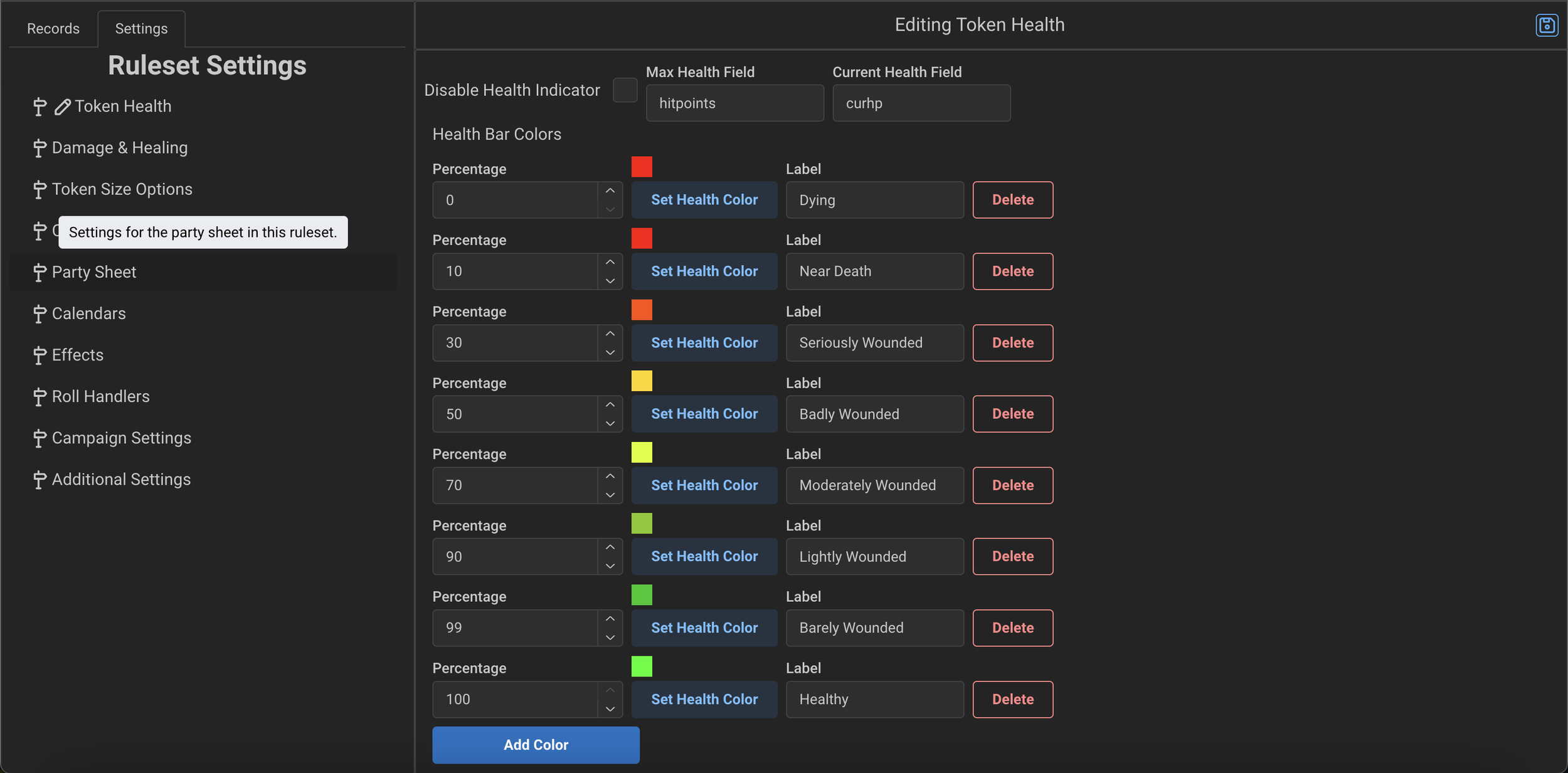
From this Section you can define which fields are used in an NPC and Characters record for the max health and current health of the token (stored in data.(fieldName).
You can also disable health indicators in the ruleset by clicking the checkbox “Disable Health Indicators.”
If both fields are defined and set properly, you can also define what the color of the health bars on the tokens should be for a given percentage remaining.
The label defined for each is the “Health Status” that is shown to players. Players do not see the Health Bars of enemy faction tokens, but will see it for Friendly tokens.
Damage & Healing
The Damage & Healing settings controls the ability to set damage or healing on a Token via the Token Context Menu (right clicking a Token) in the VTT. If enabled, the fields will show up. The scripts defined in each Accordion (Damage Script / Healing Script) are executed when a value is set. These scripts must be written per the definition of your Characters and NPCs. Note that the Health fields must be the same on both Characters and NPCs.
These scripts execute with record set as the token selected and value set as the value entered.
Here is an example:
// Apply healing
// Ignore negative healing as that is what damage is for
// This script ignores tempHp, as it is not a factor in healing
if (value > 0) {
  var curhp = record.data?.curhp || 0;
  curhp += value;
  if (curhp < 0) { curhp = 0; }
  if (curhp > record.data?.hitpoints) { curhp = record.data?.hitpoints; }
  api.setValue("data.curhp", curhp);
}
The Damage Type Icons accordion can be expanded to assign a custom icon to each damage type used by your ruleset's scripts. These icons appear wherever the damage type is shown — damage/healing buttons, roll output, and the Apply Damage UI.
The roll must be of type damage. Damage typing — the colored icon, the Apply Damage UI, and resistance/immunity/vulnerability handling — only takes effect when the roll is dispatched as a roll of type damage (the final argument to api.promptRoll(name, formula, modifiers, metadata, 'damage'), and the matching damage entry under your ruleset's roll types). A roll dispatched under any other type (attack, skill, a custom type, …) is treated as untyped no matter what damage-type string you pass, so the icon won't render and damage won't be adjusted by the target's resistances. Healing works the same way via roll type healing.
Each entry maps a damage type name (e.g. fire, slashing) to an icon. An icon value must be one of:
A Tabler icon — PascalCase with the
Iconprefix, e.g.IconFlame,IconBolt. Browse names at tabler.io/icons.A Game icon — PascalCase with the
Giprefix, e.g.GiFire,GiPoisonBottle. Browse names at react-icons.github.io/react-icons/icons/gi.One of the built-in Realm VTT damage glyphs listed below.
Names must match the icon's export name exactly, including capitalization — there is no normalization.
Built-in Realm VTT damage glyphs:
|
|
|
|
|
|
|
|
|
|
|
|
|
|
|
|
|
|
|
|
|
|
|
|
|
|
Token Size Options
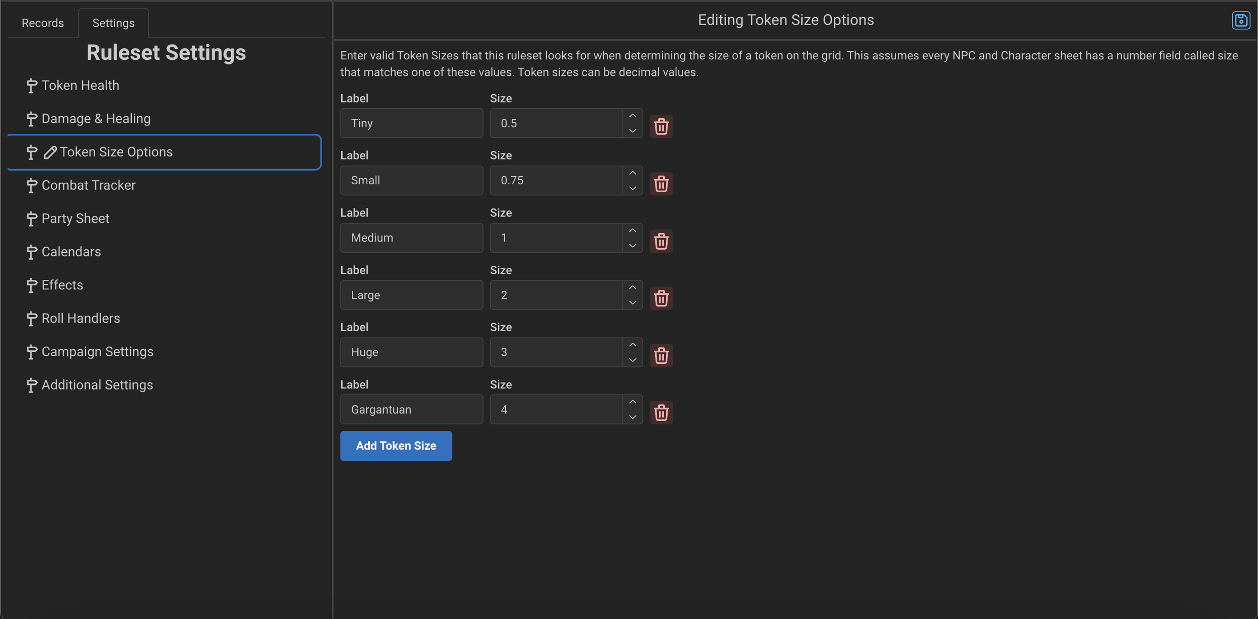
From this section, you can define what Size tokens are rendered at by the data.size field on the NPC or Character.
Note: To use this function your NPCs and Characters should define a size string field on the record that is editable.
Combat Tracker
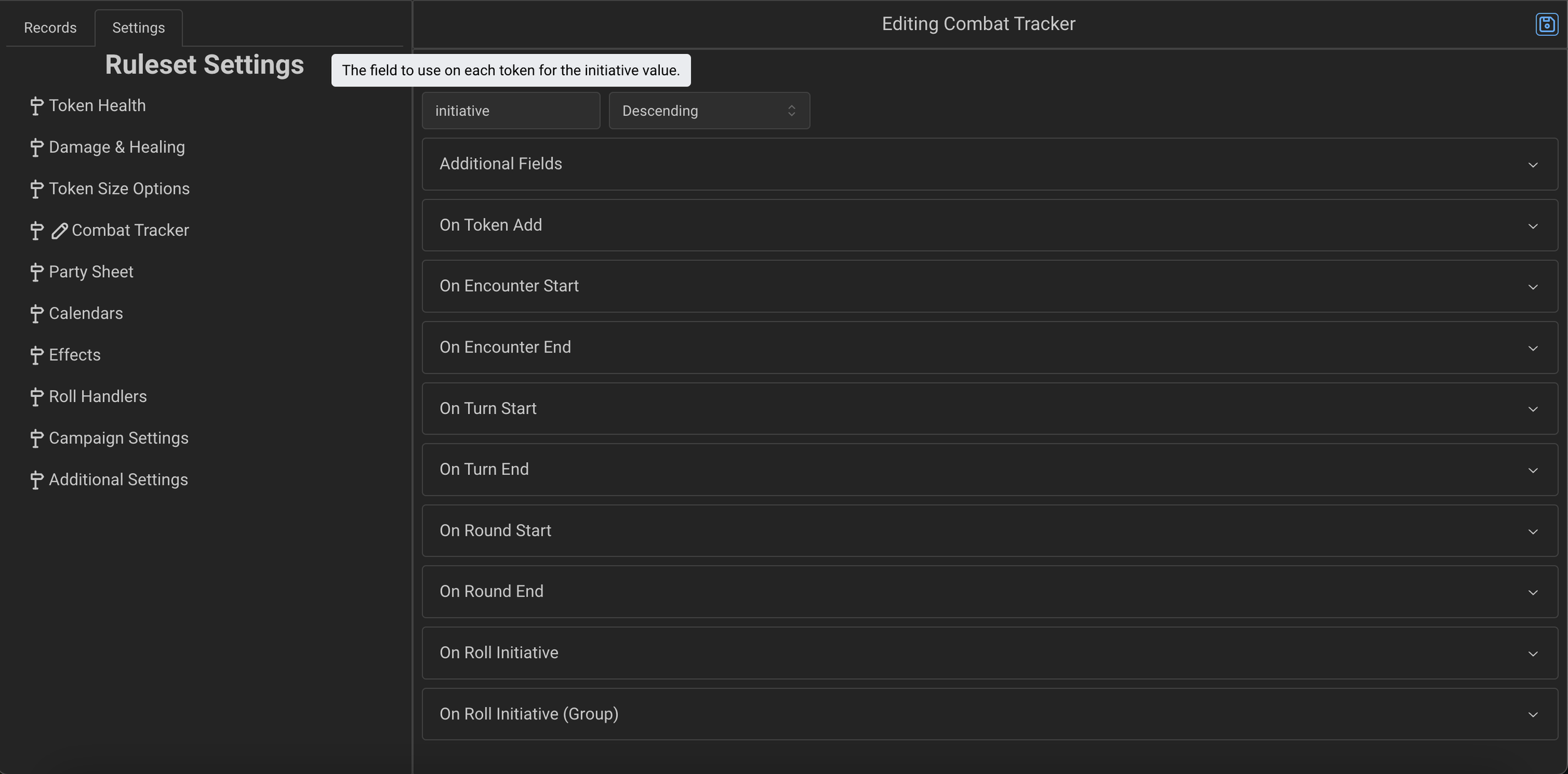
In the Combat Tracker settings you can define the value used on NPCs and Character’s for storing initiative (and rendered in the Combat Tracker) as well as whether it is descending or ascending order.
The Additional Fields accordion allows you to define additional fields that you want to render in the Combat Tracker.
Note: The fields should all be defined on both NPCs and Characters otherwise they will be empty for one or the other
The following Event Types are editable in a different script handler here, and are called at various times when the Combat Tracker is used. The Context is set per the Data above in the API section.
These scripts are only executed by the GM.
On Token Add
When a token is added to the Combat Tracker, this script is called.
On Encounter Start
When clicking Start Encounter, this script is called.
On Encounter End
When clicking End Encounter, this script is called.
On Turn Start
When clicking the Next Turn button, this script is called with the
data.tokenset to the one who’s turn is starting.
On Turn End
When clicking the Next Turn button, this script is called with the
data.tokenset to the one who’s turn is ending.
On Round Start
When clicking Next Turn (if a new round is starting) or when clicking Next Round, this script is called
On Round End
When clicking Next Turn (if a new round is starting) or when clicking Next Round, this script is called
On Roll Initiative
This script is called when the Combat Tracker “Roll Initiative” button is pressed and should define how to prompt for an initiative roll for the context’s token in
data.token
On Roll Initative (Group)
This optional script is called when the Combat Tracker “Roll Initiative for Each NPC Group” button is pressed and should define how to prompt for an initiative roll for each unique NPC
Party Sheet
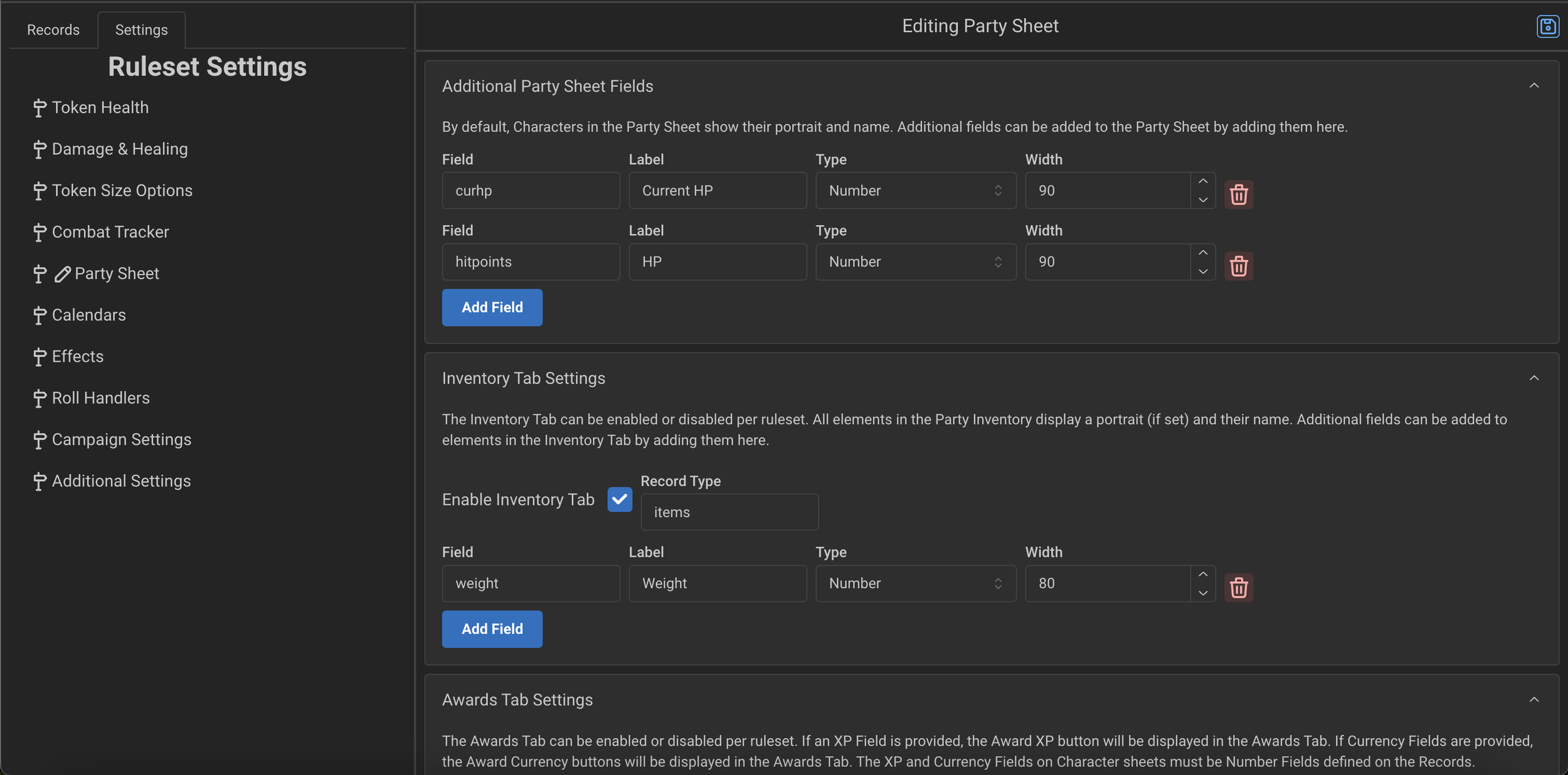
Additional Party Fields
From the Party Sheet settings you can define all the fields that are shown on each entry in the Party Sheet. The GM can add Characters to the Party Sheet. Each field defined here will show up on each entry.
Inventory Tab Settings
You can enable or disable the Inventory Tab here as well as define fields that show up for each element in the Inventory tab of the Party Sheet.
Awards Tab Settings
In the Awards Tab you can define if XP can be awarded and if so what the default method is and what the name of the field is to store XP on each Character Sheet.
You can also define a list of Currencies that will then show up in the Party Sheet and allow the GM to distribute currency to Characters in the Party.
Misc
The Party Sheet also has hooks into Encounters. For example, if there are 2 PCs in the Party Sheet and the GM has an encounter with Goblins in it, he can set the number of the Goblins in the encounter to “$PC” and it will add 2 Goblins to the Combat Tracker.
Calendars
In the Calendars setting you can define Calendars that are available in the Ruleset.
By default, all Rulesets can use the Gregorian calendar.
Effects
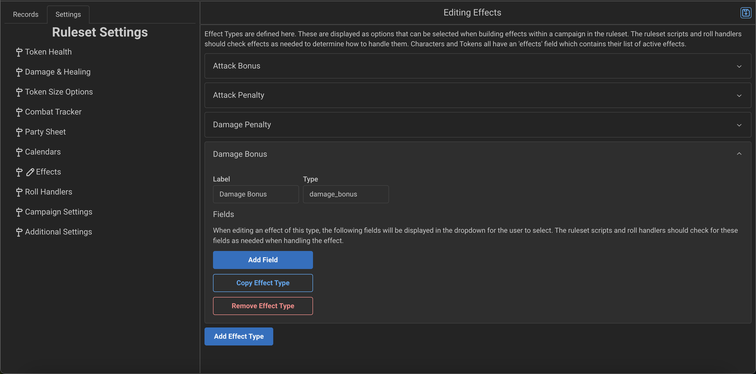
From the Effects settings we define the list of additional Rule Types that can be selected when creating Effects in the Campaign.
These Rule Types do nothing on their own, they simple provide a way for GMs and Players to add them to an Effect so that they can then be used by the scripts in the Ruleset.
The Roll Handlers and Macros throughout the ruleset should check for these Effects on tokens and add modifiers as necessary to roll prompts. You can check out the D&D 5e (2024) ruleset for a comprehensive example of how this works.
We also suggest using the Common Script in Additional Settings to define your function for gathering all the Effects (and any modifiers from token values such as equipped items, etc.) that you can then re-use and call everywhere in your ruleset code for automation of these effects.
Roll Handlers
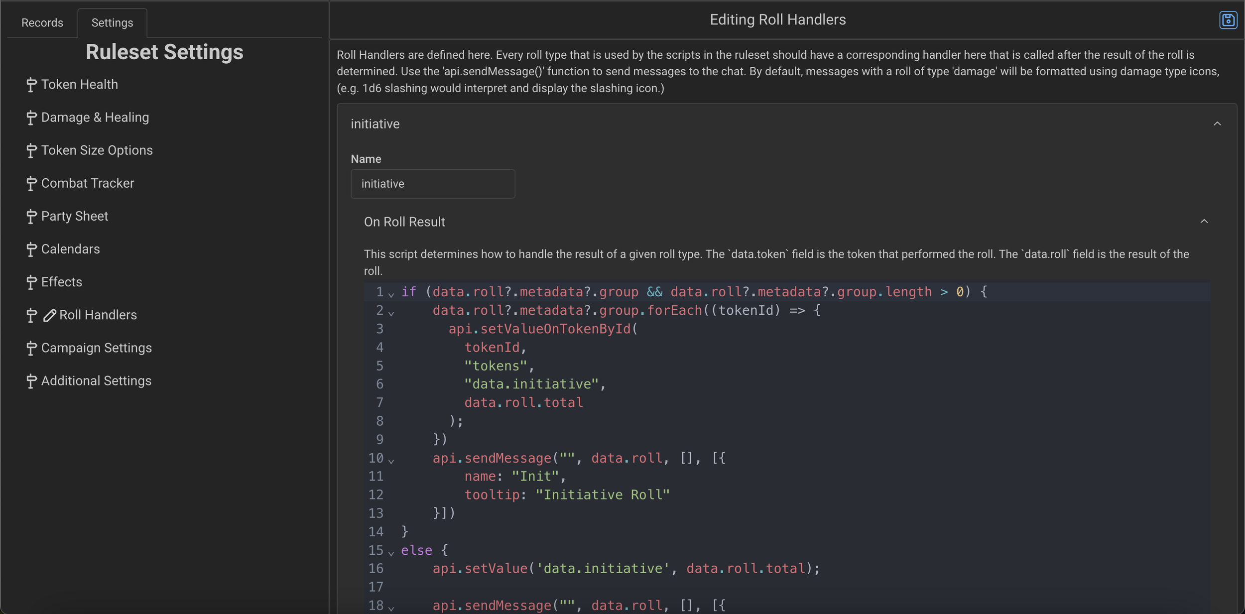
The Roll Handlers section should define a Roll Handler for every type used within your scripts. For example, if you prompt a roll in a script of type “attack” you should define a Roll Handler here called “attack” and then enter the script.
The script is called by the User who performed the Roll, so keep that in mind when writing the code. If you do not want Users to edit a token directly (for example when dealing damage) then you should have the Roll Handler output a message with a macro that the GM can use to apply damage. The D&D 5e (2024) ruleset is a good starting place to see how it is implemented there.
Metadata that was passed along to a Roll is provided here in the handler via data.roll.metadata
Campaign Settings
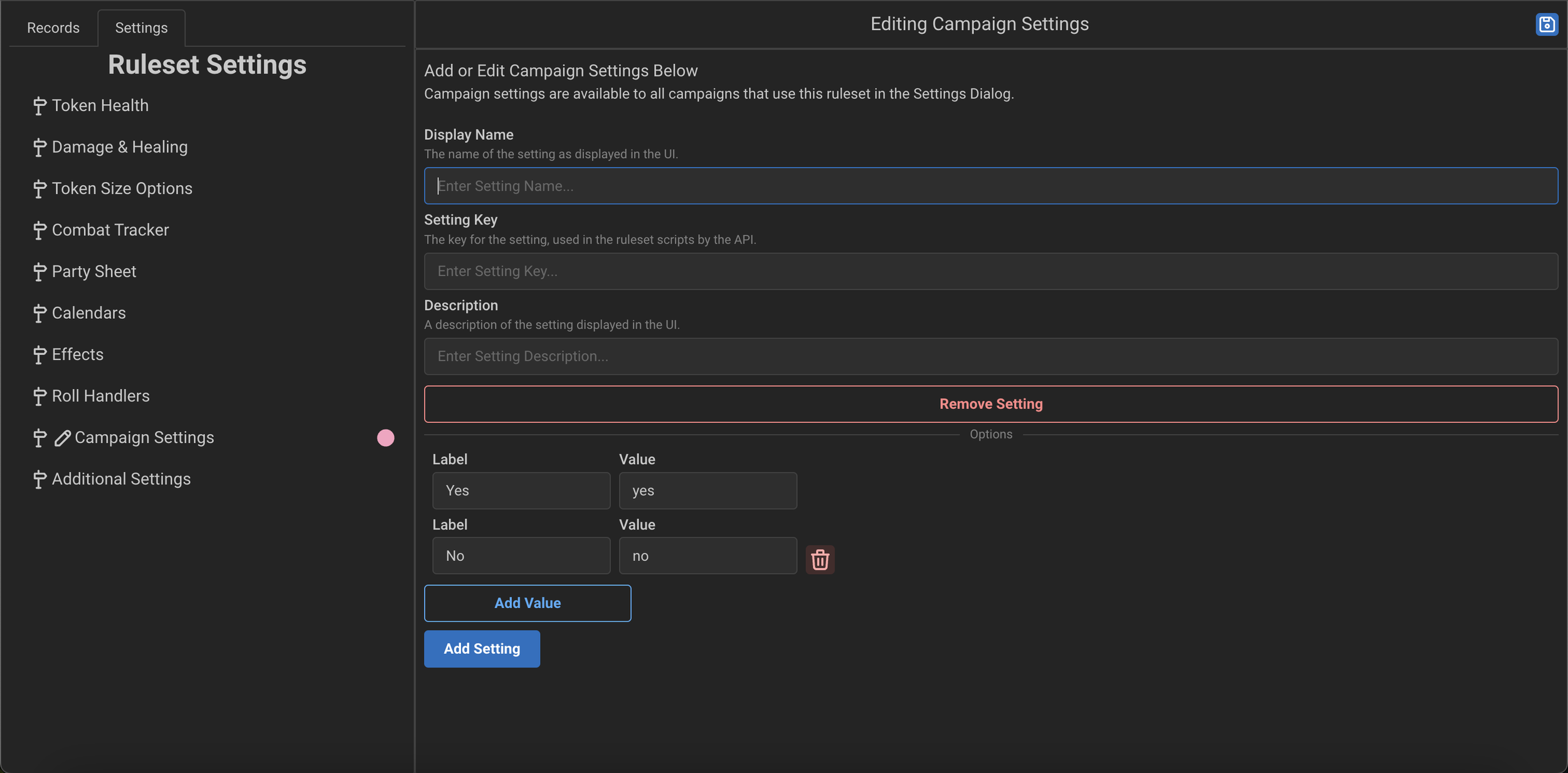
The Campaign Settings section lets you define additional settings that the GM can set for their campaign. These settings do nothing on their own, you should use the api.getSetting call to check the value of a setting in all relevant scripts.
Additional Settings
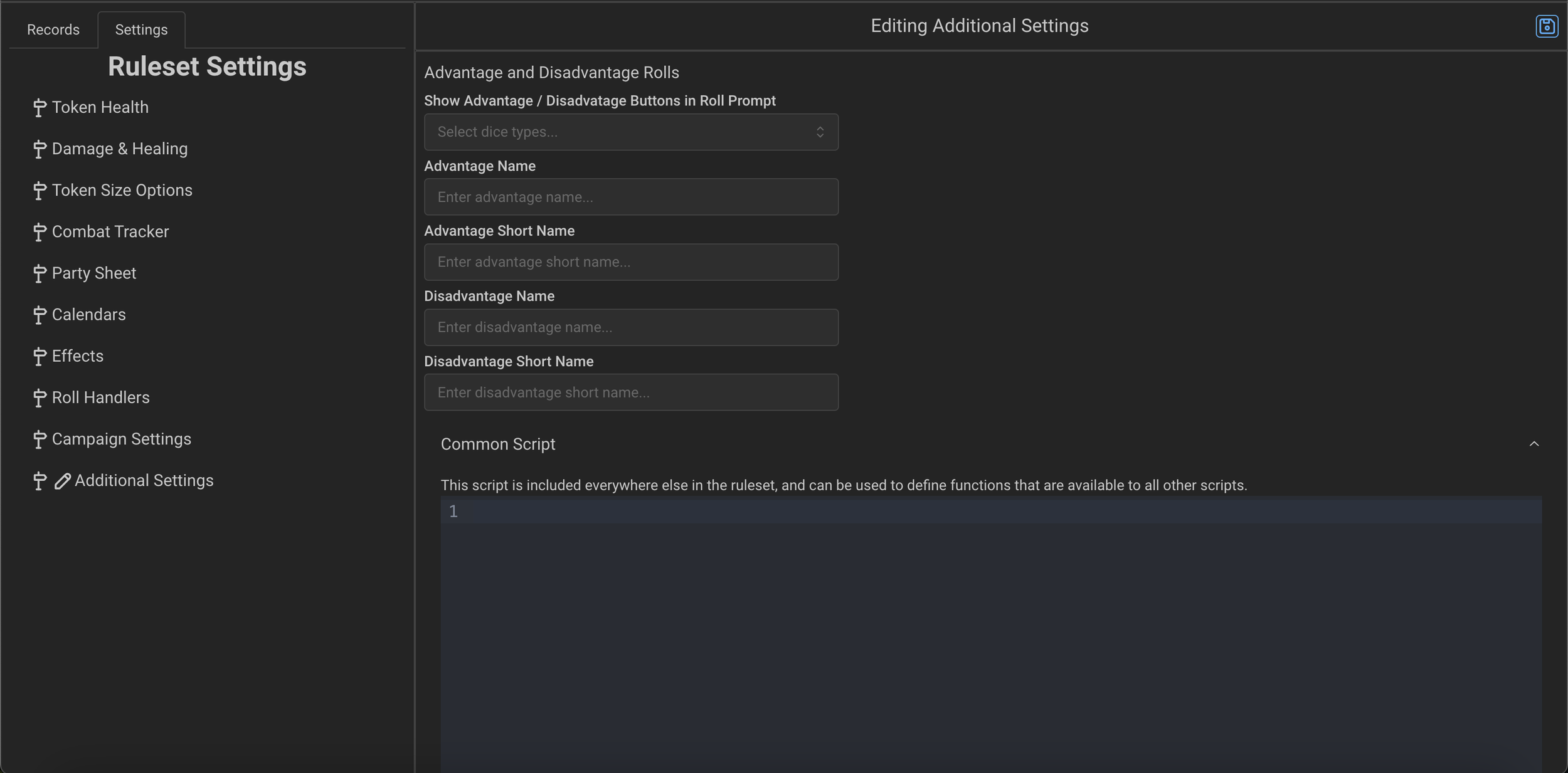
Finally, the Additional Settings section has some miscellaneous settings for the Ruleset.
Show Advantage / Disadvantage Buttons in Roll Prompt
If your ruleset has the ability to roll with some type of “advantage” (i.e. 2d20 drop lowest) or “disadvantage” you can define how this works here by selecting dice types for when the buttons should show up
Advantage Name
If your ruleset calls it something like “Boon” you can change the name here
Advantage Short Name
The short name rendered in the Dice Tray, example “ADV”
Disadvantage Name
If your ruleset calls it something like “Bane” you can change the name here
Disadvantage Short Name
The short name rendered in the Dice Tray, example “DIS”
Common Script
Here you can define all the functions you want available throughout your ruleset. You should place all common code here so that you are not re-defining it in all your scripts and records. Examples of what you might want to place in the Common Script would be functions to double dice damage, parse damage types from roll strings, collect effects and modifiers on a record or token, alter a record or token’s data when an attribute is changed, and so on.
Effects System
The Effects system allows you to create dynamic character modifications through rules that modify token data when applied. Effects can stack, have durations, present user choices, and are fully reversible when removed.
Keep in mind, that if you are leveraging ruleset defined effects (such as "saveBonus" or "savePenalty" in 5e) your Ruleset code needs to account for this. You can take a look at the code in the Common Script of the 5e system to see how Modifiers are collected for Effects (and built-in ruleset modifiers, via the Modifier List, but that is separate from the Effects System.)
Effect Management API
addEffect(effectName, actorToken, effectDuration?, effectValue?, callback?)
Adds an effect to a token by Effect Name. The effect must exist in the campaign.
effectName(string) — Name of the effectactorToken(object) — The target token to apply the effect toeffectDuration(number | { value: number, unit: string }, optional) — Overrides the effect's default duration. A plain number is interpreted in the effect's owndurationUnit(rounds for a rounds-unit effect, seconds for a time-based effect). An object{ value, unit }overrides the unit for this application too — e.g.{ value: 3, unit: "rounds" }applies it for 3 combat rounds even if the effect template isn't a rounds-unit effect. Validunitvalues:rounds,seconds,minutes,hours,days,seconds-real,end_turn,start_turn,end_applier_turn,start_applier_turn.effectValue(string | token, optional) — A custom value to store with the effect. If a token object is passed, it becomes the caster, enabling@caster.datareferences (see Caster References)callback((record) => void, optional) — Called after the effect is applied, with the updated record
addEffects(effectNames, actorToken, effectDuration?, effectValue?, callback?)
Adds an array of effects to a token by Effect Names. All effects must exist in the campaign. Duplicate effects are only applied if they are stackable or allowsMultiple (e.g., ['Stunned', 'Stunned'] applies Stunned x2 if the Stunned effect is stackable or allowsMultiple).
addEffectById(effectId, actorToken, effectDuration?, effectValue?, callback?)
Adds an effect to a token by Effect ID. The effect must exist in the campaign.
addEffectsByIds(effectIds, actorToken, effectDuration?, effectValue?, callback?)
Adds an array of effects to a token by Effect IDs. The effects must exist in the campaign. Duplicate effects are only applied if they are stackable or allowsMultiple (e.g., ['Stunned', 'Stunned'] applies Stunned x2 if the Stunned effect is stackable or allowsMultiple).
addTokenChangeEffect(npcId, actorToken, callback?)
Adds an effect to the actor token that changes their token image and size to match the given NPC. That NPC must exist in the campaign.
removeEffectById(effectId, actorToken, callback?)
Removes the effect with the given Effect ID from the token. All data modifications made by the effect are reversed.
deductEffectById(effectId, actorToken, callback?)
Deducts 1 stack of a stacked effect. If it was the last instance or was not a stacked effect, removes it entirely.
// Add a "Poisoned" effect for 60 seconds
api.addEffect("Poisoned", targetToken, 60);

// Add effect by ID with a custom string value
api.addEffectById("effect-id-1", targetToken, undefined, "Concentration on Bless");

// Add effect with the caster token (enables @caster.data references)
api.addEffect("Hex", targetToken, 60, casterToken);

// Add multiple effects by ID with caster
api.addEffectsByIds(["effect-1", "effect-2"], targetToken, undefined, casterToken);

// Change token appearance to an NPC
api.addTokenChangeEffect("npc-wolf-id", characterToken);

// Remove an effect
api.removeEffectById("effect-id-1", targetToken);

// Deduct one stack of a stacked effect
api.deductEffectById("effect-id-1", targetToken);
Rule Types
Each effect contains an array of rules that define what happens when the effect is applied. Rules are processed in order.
Data Rules
Modify individual character fields using mathematical operations. Maintains a history stack so changes are properly reversed when the effect is removed.
{
  "type": "data",
  "value": {
    "field": "ac",
    "operation": "add",
    "value": 2,
    "min": 0,
    "max": 30
  }
}
Property | Type | Description |
|---|---|---|
| string | The data field to modify (e.g., |
| string | One of: |
| number | The value to use in the operation |
| string | (Optional) Get the value from another data field instead of |
| number | (Optional) Minimum allowed result |
| number | (Optional) Maximum allowed result |
Operations:
add— Adds value to current field (works for both numbers and strings)subtract— Subtracts value from current field (numbers only)multiply— Multiplies current field by value (numbers only)divideRoundDown— Divides and rounds down (numbers only)divideRoundUp— Divides and rounds up (numbers only)
Override Rules
Replace or merge complex nested data structures. Supports deep merging, expression evaluation, @record.data and @caster.data references, and can reference choice values. Original values are stored in a snapshot for restoration when the effect is removed.
// Simple override
{
  "type": "override",
  "value": {
    "ac": 18,
    "speed": 30,
    "senses": "Darkvision"
  }
}

// Override with expressions
{
  "type": "override",
  "value": {
    "ac": "15 + @record.data.dexMod",
    "hitPoints": "@record.data.level * 10",
    "spellDC": "8 + @caster.data.proficiencyBonus + @caster.data.spellcastingMod"
  }
}
Features:
Deep Merging — When the current value is an object, nested properties are merged rather than replaced
Expression Evaluation — Values can contain
@record.data,@caster.data,@effect.count,@roll(), inline math, and logical functionsArray Handling — Arrays from the override are appended to existing arrays
Snapshot Storage — Original values are saved automatically for restoration on removal
Expression Evaluation — Values can contain
@record.data,@caster.data,@effect.count,@effect.sourceCount,@roll(), inline math, and logical functions
ChoiceSet Rules
Present a modal to the user, allowing them to choose from predefined options. The chosen value is stored and can be referenced by other rules in the same effect via @record.data.
{
  "type": "choiceSet",
  "field": "data.effects.rage.damageType",
  "valueType": "string",
  "value": {
    "prompt": "Select Damage Type",
    "choices": [
      { "label": "Fire", "value": "fire" },
      { "label": "Cold", "value": "cold" },
      { "label": "Lightning", "value": "lightning" }
    ]
  }
}
Property | Description |
|---|---|
| Where to store the chosen value (use |
|
|
| Text shown to the user in the choice dialog |
| Array of |
Notes:
Choice values can contain
@record.dataand@caster.dataexpressions — they are automatically resolvedMultiple choiceSet rules in one effect prompt sequentially
If the user cancels any choice, the entire effect is not applied
Other rules can reference the chosen value via
@record.data.effects.{effectName}.{property}
ChoiceSet with fromData
Dynamically generate choices from the token's own data:
{
  "type": "choiceSet",
  "field": "data.selectedWeaponId",
  "value": {
    "valueType": "fromData",
    "dataPath": "inventory",
    "labelPath": "name",
    "valuePath": "_id"
  }
}
Aura Rules
Create an area of effect around a token that automatically applies another effect to tokens within range.
{
  "type": "aura",
  "value": {
    "range": "10",
    "color": "#03c3e8",
    "faction": "enemy",
    "effectId": "effect_id_to_apply"
  }
}
Property | Description |
|---|---|
| Distance in map units (supports expressions like |
| Hex color for the aura visualization |
|
|
| The ID of the effect to apply to tokens within range |
Notes:
Auras are only processed by the GM
Affected tokens receive the effect with an
effectValueobject of shape{ _id, name, isAura: true, sourceCount }, wheresourceCountis the source's current stack count of the parent aura effectWhen tokens move out of range, the aura effect is automatically removed
Aura updates are throttled (1 second max) for performance
Referencing the aura source's stack count from the applied effect
The effect applied by an aura (the effectId in the aura rule) can reference the source's stack count of the parent aura effect via @effect.sourceCount. Useful when the aura's behavior should scale with the source's stacks without the source having to write that count to its own data.
The aura layer automatically re-applies the linked effect on affected recipients whenever the source's stack count changes, and rapid changes are debounced so only one reapply fires after the source settles.
{
  "tacticsDie": "ternary(eq(@effect.sourceCount,1),'d4',ternary(eq(@effect.sourceCount,2),'d6',ternary(eq(@effect.sourceCount,3),'d8','d12')))"
}
Light Rules
Add a dynamic light source to a token that casts light in the VTT environment.
{
  "type": "light",
  "value": {
    "range": "20",
    "color": "#ffaa00",
    "intensity": 2.5,
    "angle": 0,
    "flicker": 0.3,
    "falloff": 0.5
  }
}
Property | Description |
|---|---|
| Light radius in map units (supports expressions) |
| Hex color of the light |
| Brightness (0–3, default: 3) |
| Cone angle in radians (0 = omnidirectional 360°) |
| Direction the cone points |
| Flicker amount (0 = none, 1 = maximum) |
| Light falloff (0 = full bright to edge, 0.5 = D&D style bright/dim, 1 = fast falloff) |
Expression Syntax
Override rules, aura/light ranges, duration rolls, and choice values all support a rich expression language.
References
Syntax | Description | Example |
|---|---|---|
| Reference target token's data |
|
| Reference nested field |
|
| Access array element by index |
|
| Reference caster's data |
|
| Number of stacked instances |
|
| Aura source's stack count of its parent aura effect (child effect applied by an aura; undefined otherwise) |
|
Math Expressions
When an entire value is a math expression, it is automatically evaluated:
"ac": "10 + @record.data.dexMod + @record.data.level"
"hp": "@record.data.level * 8 + @record.data.conMod"
"bonus": "(@record.data.strength - 10) / 2"
Supported operators: +, -, *, /, ()
Supported functions: floor(), ceil(), min(), max(), abs()
Inline Math with Curly Braces
Use {expression} for math expressions embedded within strings:
"description": "Attack bonus: {5 + @record.data.level}"
"damage": "{4 + @record.data.level}d6"
"text": "Deal {@record.data.level * 2} damage"
Everything inside {...} is evaluated as a math expression and the result replaces the entire block. Multiple {...} blocks in one string are all evaluated independently.
Instant Dice Rolls
Use @roll(XdY) to roll dice at effect application time. The result is rolled once and cached — the same @roll() expression used in multiple rule values within the same effect produces the same number.
"curhp": "@record.data.curhp + @roll(2d6)"
"tempHp": "@roll(2d10) + @record.data.level"
Logical Functions
Function | Description | Example |
|---|---|---|
| Conditional |
|
| Less than |
|
| Less than or equal |
|
| Greater than |
|
| Greater than or equal |
|
| Equal |
|
| Not equal |
|
| Logical AND |
|
| Logical OR |
|
| Logical NOT |
|
| Logical NAND |
|
| Logical XOR |
|
Merge Expressions
Use @merge(@record.data.path) to merge an entire object from another source into the target field. When the target already exists as an object, properties are deep-merged recursively.
// Replace or merge an entire object
"strikes": "@merge(@record.data.effects.dragonForm.strikes)"

// Define base values and merge in additional values with __merge
"strikes": {
  "claw": { "damage": "1d6", "traits": ["agile"] },
  "tail": { "damage": "2d6" },
  "__merge": "@merge(@record.data.effects.dragonForm.strikes)"
}
Caster References
When adding an effect, you can pass a token as the effectValue parameter to set it as the caster. The system automatically detects that it's a token (by checking for an _id property) and makes its data available through @caster.data references. This allows the effect to scale based on the caster's stats rather than the target's.
// Pass the caster token so the effect can reference their stats
api.addEffect("Hex", targetToken, 60, casterToken);
api.addEffectById("spell-effect-id", targetToken, undefined, casterToken);
api.addEffectsByIds(["effect-1", "effect-2"], targetToken, undefined, casterToken);
Where @caster.data works
Context | Example |
|---|---|
Override rule values |
|
Override arrays |
|
Inline math in overrides |
|
Duration rolls |
|
ChoiceSet values |
|
Mixed with @record |
|
If no caster token is provided (or effectValue is a string), @caster.data references resolve to 0. For duration rolls specifically, they fall back to 1 (or a custom fallback with the pipe syntax: @caster.data.field|2).
Caster Resolution
When a token is passed as effectValue, the system automatically fetches the full caster record if needed (e.g., if only a token stub with _id was provided). This lookup is performed only once per effect application, only when at least one rule references @caster.data.
Example: Spell Effect with Caster Scaling
// Effect JSON
{
  "name": "Inspire Courage",
  "durationRoll": "[email protected]",
  "durationUnit": "rounds",
  "rules": [
    {
      "type": "data",
      "value": {
        "field": "attackBonus",
        "operation": "add",
        "value": 1
      }
    },
    {
      "type": "override",
      "value": {
        "inspiredBy": "@caster.data.name",
        "inspireDC": "8 + @caster.data.proficiencyBonus + @caster.data.charismaMod"
      }
    }
  ]
}

// API call
api.addEffect("Inspire Courage", targetToken, undefined, bardToken);
Dynamic Duration Rolls
Effects can use a durationRoll field to roll their duration dynamically when applied. The roll string supports @record.data, @caster.data, pipe fallbacks, and inline math.
{
  "name": "Bless",
  "durationRoll": "[email protected]|2",
  "durationUnit": "rounds",
  "rules": [...]
}
Example | Description |
|---|---|
| Static roll |
Caster's proficiency bonus (fallback: 1) | |
Caster's proficiency bonus (fallback: 2) | |
| Target's level as flat duration |
| Inline math (e.g., |
| Mixed record and caster references |
Fallback behavior for duration rolls:
@record.data.fieldfalls back to1if the field is missing@caster.data.fieldfalls back to1if no caster or field is missingUse the pipe syntax (
@caster.data.field|N) to specify a custom fallback value
Note: The durationRoll field takes precedence over the static duration field, but a duration explicitly passed at application time (e.g., the effectDuration parameter in the API) takes precedence over both.
Effect Properties
Property | Type | Description |
|---|---|---|
| string | Display name of the effect |
| string | Description shown to the user |
| boolean | Whether multiple instances share one tracked effect entry. Repeated applications increment |
| boolean | Whether multiple instances are tracked separately, each with its own duration/value. Repeated applications also increment @effect.count. |
| number | Static duration value |
| string |
|
| string | Dice expression rolled at application time (overrides |
| array | Array of rule objects (data, override, choiceSet, aura, light) |
Common Patterns
Choice + Override
{
  "rules": [
    {
      "type": "choiceSet",
      "field": "data.effects.dragonForm.type",
      "valueType": "object",
      "value": {
        "prompt": "Select Dragon Type",
        "choices": [
          {
            "label": "Fire Dragon",
            "value": "{ \"ac\": \"18 + @record.data.level\", \"damageType\": \"fire\" }"
          },
          {
            "label": "Ice Dragon",
            "value": "{ \"ac\": \"20 + @record.data.level\", \"damageType\": \"cold\" }"
          }
        ]
      }
    },
    {
      "type": "override",
      "value": {
        "ac": "@record.data.effects.dragonForm.type.ac",
        "breathDamageType": "@record.data.effects.dragonForm.type.damageType"
      }
    }
  ]
}
Caster-Scaled Spell
{
  "name": "Bestow Curse",
  "durationRoll": "@caster.data.level",
  "durationUnit": "rounds",
  "rules": [
    {
      "type": "override",
      "value": {
        "curseDC": "8 + @caster.data.proficiencyBonus + @caster.data.spellcastingMod",
        "curseSource": "@caster.data.name"
      }
    },
    {
      "type": "data",
      "value": {
        "field": "savingThrowPenalty",
        "operation": "subtract",
        "value": 2
      }
    }
  ]
}

// Applied via:
api.addEffect("Bestow Curse", targetToken, undefined, casterToken);
Level-Based Scaling with Ternary
{
  "type": "override",
  "value": {
    "proficiencyBonus": "ternary(lt(@record.data.level, 5), 2, ternary(lt(@record.data.level, 9), 3, ternary(lt(@record.data.level, 13), 4, ternary(lt(@record.data.level, 17), 5, 6))))"
  }
}
Dynamic Aura with Choice
{
  "rules": [
    {
      "type": "choiceSet",
      "field": "data.effects.aura.range",
      "valueType": "number",
      "value": {
        "prompt": "Select Aura Range",
        "choices": [
          { "label": "5 feet", "value": "1" },
          { "label": "10 feet", "value": "2" }
        ]
      }
    },
    {
      "type": "aura",
      "value": {
        "range": "{5 * @record.data.effects.aura.range}",
        "color": "#03c3e8",
        "faction": "enemy",
        "effectId": "debuff_effect_id"
      }
    }
  ]
}
Base + Merge
{
  "type": "override",
  "value": {
    "strikes": {
      "claw": { "damage": "1d6", "traits": ["agile"] },
      "tail": { "damage": "2d6" },
      "__merge": "@merge(@record.data.effects.form.strikes)"
    }
  }
}
Effect Application Order
ChoiceSet rules prompt the user and store values
Choice values with
@record.dataor@caster.dataexpressions are resolvedIf any rule references
@caster.dataand only a token stub was provided, the full caster record is fetched (once)Data rules are processed and applied
Override rules are processed with access to choice values and caster data
Duration is calculated (static, rolled, or passed via API)
All changes are committed atomically
Effect Removal
Data rules: Restore values from the operation history stack
Override rules: Restore values from the stored snapshot. For partial removal of a stackable override effect with stacks remaining, the snapshot is preserved and the override is re-evaluated at the decremented count so
@effect.count-dependent fields stay correct across repeated removals. On full removal (or when partial removal brings stacks to 0), the snapshot is wiped.ChoiceSet rules: Clear the stored choice value
Record Creation / Character Wizards
Wizards can be created for any record, such as Characters, NPCs, or custom Records.
This is by clicking the "Record Wizard" tab after selecting a type to edit, click "Enable Record Wizard", and then click "Add a Step".
This will default the Wizard with the following code:
<script>
  function onStepEnd(stepIndex) {
    // This is called when the user goes to the next step.
    // All fields in the wizard are available in the record's 'data.wizard' context.
  }
</script>

<div>
</div>
Some things to note with Character Wizards:
onStepEndis called after each StepEach step can have an option name and previous step name.
Without a previous step name, it prevents users from going back to that step.
Wizards use the same HTML/API as Records, with one exception: All fields' values are placed under
data.wizard.{fieldName}. For example a field withfield='selectedClass'will be set underrecord.data.selectecClass.For examples of working Character Wizards see one of the following rulesets:
Cyberpunk RED: https://github.com/seansps/realmvtt-cpr
Best Practices
Use namespaced field paths for choices:
data.effects.{effectName}.{property}(e.g.,data.effects.dragonForm.type)Use curly braces for inline math:
"{4 + @record.data.level}d6"not"4 + @record.data.level d6"Always use full prefixes:
@record.data.fieldand@caster.data.fieldInitialize target fields as empty objects
{}, notnull, when they will receive override merges (MongoDB cannot create fields inside null)Test with missing data: Missing
@record.dataresolves to0; missing@caster.dataresolves to0in overridesPut expressions in choice values, not in the override — they are evaluated once when the choice is made