Advanced Ruleset Sheet CSS
Advanced Ruleset Sheet CSS
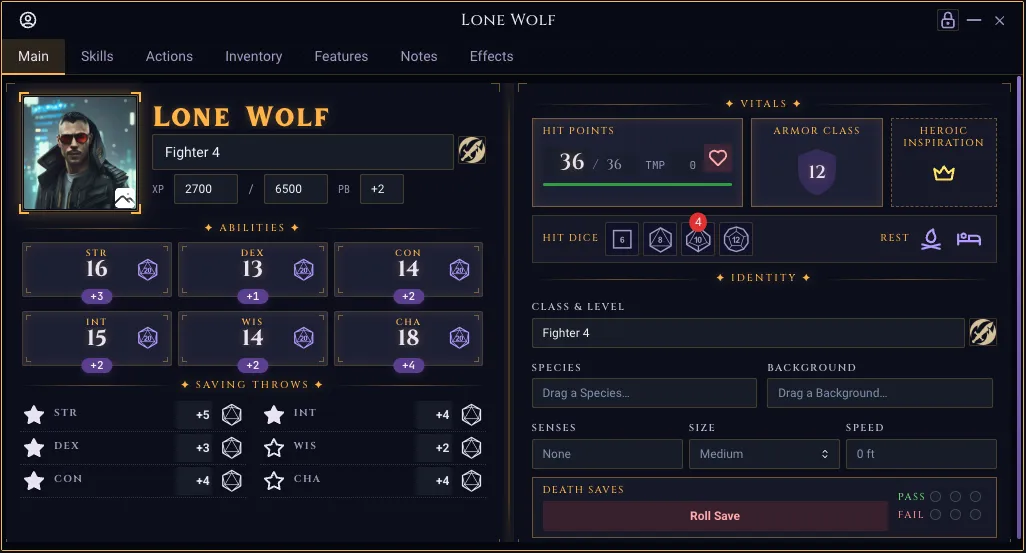
This page documents how you can stylize your sheets in rulesets to match the two-column spread used by the 5e ruleset in Realm VTT, as well as other rulesets.
All classes degrade gracefully on themes that do not opt in to the look (Realm VTT Dark, Hacker, Dracula, etc.). When a sheet token is undefined the var(--token, fallback) fallback resolves to a Mantine default, so the markup stays usable but un-themed.
Example of 2-page spread:
1. Theme tokens
Per-theme palettes are declared on <body> and only become active on the themes that opt in. Use them in custom ruleset CSS via var(--token, fallback).
Defined on body.occult-theme, body.theme-realm-vtt-occult, body.theme-realm-vtt-dark, and body.theme-realm-vtt-light.
Token | Purpose |
|---|---|
| Primary accent color (amber on dark themes, deep amber on light). |
| Soft glow color used in |
| Very low-alpha accent for inset glows / spine band. |
| Page background color (used by |
| Default surface color one step up from |
| Elevated surface (cards, AC/HP plates, fancy AttributeField). |
| Primary foreground text color. |
| Secondary text — class lines, helper labels, ability mods. |
| Tertiary text (~55% alpha of |
| Default 1px border color. |
| High-contrast border for cards, dividers, corner ticks. |
| Color used for dotted leader lines on save/skill rows. |
| Theme-correct red for destructive UI. |
| Theme-correct green. |
|
|
|
|
| Cinzel on themed sheets, body font otherwise. |
| Inlander on themed sheets, body font otherwise. |
| JetBrains Mono / system mono. |
| Default radius for sheet cards ( |
Light theme intentionally has --card-inset-glow: none and a flat ink-shadow --text-glow so it reads as parchment, not a glowing dark UI.
2. Sheet primitives (src/index.css)
These classes live in the global stylesheet and can be used anywhere in ruleset HTML. They are pure CSS — no component is required.
2.1 Page spread
<div class="rvtt-sheet-spread-host sheet--spread">
  <div class="rvtt-sheet-spread">
    <div class="rvtt-sheet-page rvtt-sheet-corners">
      <span class="rvtt-sheet-corner rvtt-sheet-corner--tl"></span>
      <span class="rvtt-sheet-corner rvtt-sheet-corner--tr"></span>
      <span class="rvtt-sheet-corner rvtt-sheet-corner--bl"></span>
      <span class="rvtt-sheet-corner rvtt-sheet-corner--br"></span>
      <!-- left page content -->
    </div>
    <div class="rvtt-sheet-page rvtt-sheet-corners">
      <span class="rvtt-sheet-corner rvtt-sheet-corner--tl"></span>
      <span class="rvtt-sheet-corner rvtt-sheet-corner--tr"></span>
      <span class="rvtt-sheet-corner rvtt-sheet-corner--bl"></span>
      <span class="rvtt-sheet-corner rvtt-sheet-corner--br"></span>
      <!-- right page content -->
    </div>
  </div>
</div>
Class | Notes |
|---|---|
| Wrap the spread to enable container queries. Sets |
| Two-column flex layout with the "HybridSpine" — a soft 10px-wide inset-glow band drawn by |
| Each column. Adds 10px / 14px padding and |
| Cascade marker. Add this to the spread (or any ancestor) so every Mantine input label inside flips to Cinzel + 10px uppercase + theme-mixed dim color. Targets |
Container query. When the host is narrower than 720px the spread reflows to a single column and both spine pseudo-elements hide. Use the host's inline-size, not the viewport, so a docked record window collapses correctly.
2.2 Hybrid divider
<div class="rvtt-sheet-divider">
  <span class="rvtt-sheet-divider__label">CORE</span>
</div>
Center label flanked by gradient hairlines. Label uses --accent with --text-glow.
2.3 Section box with corner brackets
<div class="rvtt-sheet-section rvtt-sheet-corners">
  <span class="rvtt-sheet-corner rvtt-sheet-corner--tl"></span>
  <span class="rvtt-sheet-corner rvtt-sheet-corner--tr"></span>
  <span class="rvtt-sheet-corner rvtt-sheet-corner--bl"></span>
  <span class="rvtt-sheet-corner rvtt-sheet-corner--br"></span>
  <!-- content -->
</div>
Class | Notes |
|---|---|
|
|
| Marker class — required parent for |
| 9×9 L-bracket corner marks pinned flush to each edge with no inset. Use |
2.4 Identity & typography helpers
Class | Style |
|---|---|
| 10px Cinzel uppercase, 0.14em tracking, |
| 28px Inlander display name with text-overflow ellipsis. Uses |
| 11px Cinzel uppercase 0.18em tracking, |
| 10px JetBrains Mono, |
2.5 HP card
<div class="rvtt-sheet-hp-card">
  <label class="rvtt-sheet-label rvtt-sheet-label--accent" label="Hit Points">
  </label>
  <div class="rvtt-sheet-hp-row">
    <numberfield
      class="rvtt-sheet-hp-current"
      field="curhp"
      size="xs"
      hidecontrols="true"
      width="48px"
      placeholder="0"
    ></numberfield>
    <span class="rvtt-sheet-hp-divider">/</span>
    <numberfield
      class="rvtt-sheet-hp-max"
      field="hitpoints"
      size="xs"
      hidecontrols="true"
      width="36px"
      placeholder="0"
    ></numberfield>
    <span class="rvtt-sheet-hp-temp-label">TMP</span>
    <numberfield
      class="rvtt-sheet-hp-temp"
      field="tempHp"
      size="xs"
      hidecontrols="true"
      width="32px"
      placeholder="0"
    ></numberfield>
  </div>
  <progressbar
    class="rvtt-sheet-hp-bar"
    field="curhp"
    currentvaluefield="curhp"
    maxvaluefield="hitpoints"
    color="health"
    size="xs"
  ></progressbar>
</div>
Class | Style |
|---|---|
| 1px |
| Baseline-aligned flex row. |
| Wraps a |
| The literal |
| 14px Cinzel left-aligned, |
| Pushed right via |
| "TEMP" caption. |
| Track-only chrome (4px, dark inset, 1px border). The fill comes from a Mantine |
2.6 AC card
<div class="rvtt-sheet-ac-card">
  <label
    class="rvtt-sheet-label rvtt-sheet-label--accent rvtt-sheet-label--wrap"
    label="Armor Class"
  ></label>
  <div class="rvtt-sheet-ac-shield">
    <numberfield
      class="rvtt-sheet-ac-value"
      field="ac"
      size="xs"
      variant="unstyled"
      hidecontrols="true"
      placeholder="10"
    ></numberfield>
  </div>
</div>
.rvtt-sheet-ac-shield paints a 56×56 mask-based shield silhouette behind the input using var(--mantine-primary-color-filled) (theme-correct) and a glow drop-shadow keyed off --accent-glow. The mask SVG is inlined into the stylesheet — no asset import needed. The number sits in front (z-index 1) at 18px Cinzel.
2.7 Death-save pips
<div class="rvtt-sheet-deathsave-pips">
  <label class="rvtt-sheet-label" label="Pass" color="green"></label>
  <counter
    field="deathSaveSuccesses"
    color="green"
    maxvalue="3"
    size="xs"
  ></counter>
  <label class="rvtt-sheet-label" label="Fail" color="red"></label>
  <counter
    field="deathSaveFailures"
    color="red"
    maxvalue="3"
    size="xs"
  ></counter>
</div>
Reshapes the <counter> field's underlying Mantine checkboxes into 11px outlined circles and hides the check icon. Border + fill colors come from the counter's color prop via --checkbox-color, not from this class — so swap color="green"/color="red" to retint.
2.8 Ability + saves grids
Class | Layout |
|---|---|
|
|
| Two equal columns, no row gap. |
| Vertical stack within a column. |
| One save row: |
| Right-aligned |
2.9 Skills tab (container-queried)
<div class="rvtt-skills-tab sheet--spread">
  <div class="rvtt-skills-grid">
    <div class="rvtt-skill-row">
      <iconbutton
        field="acrobaticsProf"
        size="md"
        variant="subtle"
        options='[{"icon": "IconStar", "label": "Not Proficient", "value": "false"}, {"icon": "IconStarFilled", "label": "Proficient", "value": "true"}]'
        onchange="setProficiency(value, 'acrobatics')"
      ></iconbutton>
      <dropdown
        class="rvtt-skill-ability"
        label="Acrobatics"
        field="acrobaticsAbility"
        defaultvalue="dexterity"
        size="xs"
        width="100%"
        options='[…ability options…]'
      ></dropdown>
      <numberfield
        class="rvtt-skill-mod"
        field="acrobaticsMod"
        size="xs"
        hidecontrols="true"
        showsign="true"
        placeholder="+0"
      ></numberfield>
      <iconbutton
        field="Acrobatics Check"
        size="md"
        variant="subtle"
        options='[{"icon": "d20", "label": "Roll Acrobatics", "value": "roll"}]'
        onclick="rollCheck('acrobatics')"
      ></iconbutton>
    </div>
    <!-- ...more rows -->
  </div>
</div>
Class | Notes |
|---|---|
| Container query host. Sets |
| 2-column grid; collapses to single column at |
| Bottom-aligned flex row with the same dotted leader as |
| Wraps a |
| Same chrome-stripped 36px right-aligned |
| For "Other Skills" rows: borderless |
2.10 Responsive visibility (viewport)
Show or hide an element based on the device form factor. Unlike the container-queried primitives above (which respond to the record window's own width), these key off the viewport, so they follow the physical screen: a phone stays "mobile" even in a full-width sheet, and a desktop popped-out narrow window is not treated as mobile. Apply them with a plain class attribute on any element in your sheet HTML.
<!-- A compact roll button that only appears on phones -->
<button class="rvtt-mobile-only" field="quickRollBtn" onclick="quickRoll()">
  Roll
</button>

<!-- A wide details column hidden on phones to save space -->
<div class="rvtt-desktop-only">…detailed stat block…</div>
Class | Notes |
|---|---|
| Hidden by default; shown at viewport width ≤ 768px (the app's global mobile cutoff). |
| Shown by default; hidden at viewport width ≤ 768px. |
Reacting to the record window's own width (container query). Sometimes you want "the sheet itself is narrow" — a docked or popped-out window dragged small — regardless of screen size. Container queries can only target an ancestor that is a container, so wrap the toggled content in a .rvtt-cq-host element:
<div class="rvtt-cq-host">
  <div class="rvtt-cq-narrow-only">shown when the sheet is narrow</div>
  <div class="rvtt-cq-wide-only">shown when the sheet is wide</div>
</div>
Class | Notes |
|---|---|
| Wrap the toggled content. Sets |
| Hidden by default; shown when the host is ≤ 600px wide. |
| Shown by default; hidden when the host is ≤ 600px wide. |
Viewport vs. container. .rvtt-mobile-only / .rvtt-desktop-only track the device (phone vs. desktop); .rvtt-cq-* track the record window's own width. Reach for the container variant for layout that should collapse when the window is dragged narrow — the same principle behind .rvtt-sheet-spread-host (§2.1) and .rvtt-skills-tab (§2.9).
Re-showing and display. A re-shown element reverts to its default display (block for a <div>). If a mobile-only element must be flex or grid, pair it with your own class that sets display — the utility only toggles visibility, it doesn't impose a layout mode.
2.11 Responsive window utilities
.rvtt-cq-* (§2.10) requires a wrapper. For the common cases there's a ready-made utility set that needs no wrapper at all: every sheet layout is mounted inside .rvtt-sheet-root, which is a named container (sheet). Drop a class on any element and it reacts to the record window's own width. (Each popped-out list record gets its own .rvtt-sheet-root, so a nested sheet queries its own width.)
Desktop-first. The base class is the wide layout; a -<tier> suffix takes effect when the window is that width or narrower.
Tier | Applies when window ≤ |
|---|---|
| 360px |
| 480px |
| 600px |
| 768px |
Family | Effect at/below the tier | Needs |
|---|---|---|
| hides the element | — |
| shows the element (hidden by default) | — |
| flex row → column |
|
| grid columns become | a grid — use base |
The base helpers .rvtt-cols-1 … .rvtt-cols-4 set display:grid and the wide column count, so .rvtt-cols-<n>-<tier> has a grid to restyle without hand-writing display:grid.
<!-- Two columns side by side; stack them once the window is ≤ 600px -->
<div style="display:flex; gap:8px" class="rvtt-stack-md">
  <div>Stats</div>
  <div class="rvtt-hide-sm">Extra detail — dropped under 480px</div>
</div>

<!-- 4-up grid that steps down as the window narrows -->
<div class="rvtt-cols-4 rvtt-cols-2-md rvtt-cols-1-sm" style="gap:6px">
  …
</div>
Classes compose: apply several tiers to the same element (rvtt-cols-2-md rvtt-cols-1-sm) and the narrowest matching tier wins. The set is curated (not every Tailwind utility) — reach for a per-feature container query (§2.1, §2.9) when you need something outside hide / show / stack / cols.
.rvtt-sheet-root is a containing block. Because it establishes a container, it also becomes the containing block + stacking context for its descendants. Portaled overlays (HoverCard/Menu/Tooltip with withinPortal) render outside it and are unaffected; a non-portaled position: fixed element authored inside a sheet would now anchor to the sheet body instead of the viewport.
3. Component CSS modules
These are scoped CSS modules that ship with their components. You opt into them from ruleset HTML through the lowercase containervariant / variant attributes — you don't write the inner class names by hand, but you may need them when authoring custom skins or overriding via theme CSS.
3.1 AttributeField (AttributeField.module.css)
In ruleset HTML you choose a variant via the lowercase containervariant attribute on <attribute>. Two variants beyond the default exist:
containervariant="bordered"
<attribute
  field="strength"
  modifierfield="strengthMod"
  label="STR"
  containervariant="bordered"
  modifierposition="bottom-center"
  showbutton
  buttonicon="d20"
  buttonposition="right"
  onclick="rollCheck('strength')"
></attribute>
.bordered — adds a 1px default border, default radius, 8px padding, and a "legend"-style label that floats on the top border (.containerLabel). Modifier badge/input positions (.modifierBadge[data-position=...] and .modifierInput[data-position=...]) anchor against the bordered container when present, otherwise against the score wrapper.
containervariant="fancy" ("Tarot ability card")
<attribute
  field="strength"
  modifierfield="strengthMod"
  label="STR"
  size="sm"
  width="100%"
  placeholder="0"
  modifierdefaultvalue="+0"
  modifierposition="bottom-center"
  containervariant="fancy"
  textalign="center"
  bold="true"
  showbutton
  buttonicon="d20"
  buttonsize="lg"
  buttonvariant="subtle"
  buttonposition="right"
  onclick="rollCheck('strength')"
  onchange="setModifier(value, 'strength')"
></attribute>
.fancy — the signature 5e / Level Up ability card:
Class | Role |
|---|---|
| Card container. Uses |
| Four 5×5 L-bracket corner ticks pinned 3px in. Use |
| "KEY" label at the top. Uses |
| 3-column score row (left button slot / centered score / right button slot). Score stays centered regardless of which side has a button. |
| Absolute-positioned button slot, vertically centered, |
Score input inside .fancy: 22px Cinzel, transparent chrome (Mantine --input-bg/--input-bd/padding tokens are forced to transparent/0 because unstyled alone doesn't clear them when the field is disabled), fixed 44px width, fixed line-box height. Do not add field-sizing: content to this input — it auto-sizes height and causes the field to jump when transitioning from placeholder to value.
Mod pill inside .fancy (.modifierBadge and .modifierInput): absolutely positioned at bottom: -8px, centered, theme-primary fill. The editable variant is force-collapsed to its intrinsic 44px width with max-width: 56px because Mantine's NumberInput defaults to ~200px.
3.2 Portrait — Inscribed Plate variant (Portrait.module.css)
<portrait variant="fancy" width="120px" height="120px"></portrait>
Class | Role |
|---|---|
| 4px radius, |
| Four 10×10 etched corner brackets in |
The image inside gets a 2px inner radius so it sits flush within the 1px shadow gap.
3.3 Window chrome cleanup (Window.module.css, RecordWindowContent.module.css)
Two background patterns were removed on this branch — these are deletions, not new APIs, but worth noting since downstream rulesets may have relied on them:
The occult-theme crosshatch that used to paint on
.windowContent:not([data-is-record-window="true"])is gone.The occult-theme dot pattern on
.windowHeader::beforeis gone (replaced withbackground-image: none).The occult-theme crosshatch on record tab panels (
.recordTabs .mantine-Tabs-panel) is gone.
If a ruleset assumed those patterns existed for visual texture, paint them locally instead.
4. Authoring guide
Want a sheet that looks like the new 5e / Level Up sheets? Wrap your record layout HTML in:
<div class="rvtt-sheet-spread-host sheet--spread">
  <div class="rvtt-sheet-spread">
    <div class="rvtt-sheet-page rvtt-sheet-corners">
      <span class="rvtt-sheet-corner rvtt-sheet-corner--tl"></span>
      <span class="rvtt-sheet-corner rvtt-sheet-corner--tr"></span>
      <span class="rvtt-sheet-corner rvtt-sheet-corner--bl"></span>
      <span class="rvtt-sheet-corner rvtt-sheet-corner--br"></span>
      <!-- left page: identity, HP/AC, abilities -->
    </div>
    <div class="rvtt-sheet-page rvtt-sheet-corners">
      <span class="rvtt-sheet-corner rvtt-sheet-corner--tl"></span>
      <span class="rvtt-sheet-corner rvtt-sheet-corner--tr"></span>
      <span class="rvtt-sheet-corner rvtt-sheet-corner--bl"></span>
      <span class="rvtt-sheet-corner rvtt-sheet-corner--br"></span>
      <!-- right page: saves, skills, etc. -->
    </div>
  </div>
</div>
Then compose pages from the primitives above. Use <attribute> with containervariant="fancy" for ability cards and <portrait variant="fancy"> for the inscribed-plate header.
Want the typography but not the spread? Add sheet--spread to any container; that's the only class that flips Mantine input labels to Cinzel.
Want it on a custom theme? Define the tokens listed in §1 on your own body.theme-foo selector. Any token you omit falls back to a Mantine default. At minimum define --accent, --bg, --surface-elev, --fg, --border-strong, --divider, and the three font tokens to get a recognizable look.
Note for light themes. The light parchment palette deliberately sets --card-inset-glow: none and a 1px ink-shadow --text-glow. If you fork the light theme, keep glows off — the design assumes ink, not luminance.
5. Datapad theme (sci-fi sheets)
A parallel theme to "Grimoire × Tarot" for sci-fi rulesets (SWRPG, Genesys). Same structural primitives, different chrome: chamfered corners via clip-path, Rajdhani uppercase labels, and a configurable accent (cyan default for system-agnostic / Genesys, amber for SWRPG).
Wrap a sheet's content in class="sheet--datapad" (optionally with sheet--datapad--swrpg to flip the accent to amber). Then compose sections with .rvtt-datapad-section instead of .rvtt-sheet-section.
<div class="sheet--datapad">
  <div class="rvtt-datapad-section">
    <div class="rvtt-datapad-divider">
      <span class="rvtt-datapad-divider__label">Attributes</span>
    </div>
    <!-- attributes go here -->
  </div>
</div>
5.1 Theme tokens
Datapad reads the active theme's --bg, --surface, --surface-elev, --fg-dim, and --text-glow tokens so it adapts to Occult / Dark / Light without hardcoded colors. The accent and its derived border / glow values are datapad-specific (cyan or amber).
Token | Purpose |
|---|---|
| Primary accent — cyan |
|
|
| 12% accent — reserved for inset glows / highlight bands. |
| 22% accent — section borders / hairlines. |
| 50% accent — section + page borders, divider hairlines. |
| Page background. Falls back to |
| Section background. Falls back to |
| Elevated surface (divider label chip). Falls back to |
| Secondary text. Falls back to |
| Display-name |
|
|
|
|
To customize per-theme (e.g. shift cyan toward teal on a custom theme), override --datapad-accent inside that theme's body selector. Borders and glows recompute via color-mix.
5.2 Primitives
Class | Notes |
|---|---|
| Cascade marker. Sets datapad tokens and flips Mantine input labels to Rajdhani uppercase (analog of |
| Modifier — overrides |
| Bordered panel with chamfered corners (8px diagonal notches via |
| Outer two-page-spread page with chamfered corners (10px notches). Pair with |
| Solid hairline + bracketed-label divider. Replaces the Cinzel-with-stars divider. |
| Inner span. Wraps text in |
| Small Rajdhani uppercase label (analog of |
| Modifier — colors the label with the datapad accent. |
| Allows the label to wrap and centers each line. |
| Inline mono-dim text for data lines (LVL/XP/REST counters). |
| Large Rajdhani uppercase character name. Glow is theme-aware. |
| Optional 1px scanline overlay applied to a wrapper for an extra "monitor readout" feel. |
5.3 Two-page spread (optional)
If a sheet benefits from a left/right split, wrap with the datapad spread classes. The container query collapses to one column under 720px.
<div class="rvtt-datapad-spread-host sheet--datapad">
  <div class="rvtt-datapad-spread">
    <div class="rvtt-datapad-page"><!-- left --></div>
    <div class="rvtt-datapad-page"><!-- right --></div>
  </div>
</div>
Most sci-fi sheets work better as a single-column flow of stacked .rvtt-datapad-section panels (which collapse responsively on their own). Reserve the spread for genuinely two-column information.
5.4 Authoring guide
Want the datapad sheet? Wrap content in <div class="sheet--datapad">, add sheet--datapad--swrpg for amber. Compose with .rvtt-datapad-section + .rvtt-datapad-divider + .rvtt-datapad-label.
For attributes, use <attribute> with containervariant="fancy", showbutton, buttontext="Roll", and buttonposition="bottom" so the Roll button sits beneath the dice-pool value. The .fancy card's horizontal padding is auto-bumped to 14px when nested under .sheet--datapad so longer labels (WILLPOWER, PRESENCE) clear the L-bracket corner ticks.
Want the typography but not the chamfered chrome? Add sheet--datapad to any container — the cascade marker is what flips Mantine input labels to Rajdhani. The .rvtt-datapad-section is opt-in on a per-block basis.
Custom accent. Override --datapad-accent in a body selector or on the host element. Border, border-strong, and glow all recompute via color-mix so retinting is one declaration.